Mission: Mobile Makeover

-
Jeff M. Software Engineer
- Nov 4, 2011
As previously reported, we recently released a brand new mobile site, hand made with love for our more than 8 million users with mobile Webkit browsers who visited www.yelp.com from mobile devices in August.
Surprisingly, there are a lot of challenges when creating a whole new, albeit mini, website (who would have thought?).
If you were to look online for guidance on designing a mobile website, you would come across lots of articles that cover three main considerations:
- The once precise cursor is now your chubby, fumbling finger
- You have to present a lot of data on a wee-small screen
- Wireless networks, no matter what commercials say, tend to be slow We aren’t going to reiterate those challenges here today. Instead, we will discuss some lesser publicized challenges and opportunities that we at Yelp were presented with.
For the first iteration of the mobile site, we wanted to focus on the ease of discovery.
Users are goal oriented on mobile devices; they want to get from their home screen to their destination as fast as possible and with the least amount of distraction. So naturally, our big question was “how can we help our users find great local businesses as easily as possible?”
Although Siri tries, there is no silver bullet. The answer is multifaceted and involves both technical and design decisions.
Making the design unobtrusive and useful
When you type “yelp.com” in your smart phone browser, you are instantly directed to our new mobile site and the first thing you see is a search bar. No frills, no meaningless decoration, no lengthy explanation of what Yelp does (because who doesn’t already know!).
Directly underneath the search bar is a list of categories. No header, no extraneous explanation that these are categories, no distractions.
Finally, just below the category list, we show off one of our newest features: Hot New Businesses.
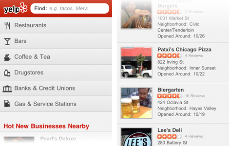
Without even scrolling the page we have covered three user profiles: the hurried user that knows exactly what he wants to find, the user that knows she wants to find something and the user that is just casually seeing what’s new around them.
Once clicking through to a business page, you will immediately see a map of the business and calls to action for getting directions or calling the business.
If you are still undecided about the business, scroll down to quickly consume short but helpful commentary using Photos, Review Highlights and Quick Tips.
Meanwhile, users that have a bit more time on their hands (jealous) can keep scrolling and read full-length reviews about the business.
Once again, we have catered to three user profiles (concentrated, curious and casual) in order of their immediacy.
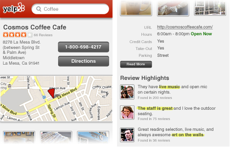
Leisurely users are likely sitting on a comfortable sofa and can afford to flick the page around and browse longer-form content. However, the on-the-go (read: mobile) user needs to immediately see the tools that they need to complete their goal with ease and without distractions.
Making the design understandable
Giving the user the appropriate content in the appropriate place is a huge step to our overall goal. However, if the user doesn’t know how to interact with the content, it is all for naught.
Even though a huge win for mobile sites is the “code once, run anywhere” principle, there seems to be a knee-jerk reaction to make everything look and behave like the iPhone. This is wrong and something that we were guilty of.
There are at least two reasons why that way of thinking is harmful:
- Our friends on Android, Blackberry or Windows 7 phones aren’t familiar with the iOS design patterns. While the “Save” button in the upper right of the title bar, the red notification indicator and the dock-style navigation bar are great conventions; they are foreign on non-iOS users.
- All those sexy animations and gradients that are laced throughout the iPhone’s interface are nearly impossible to render smoothly, if at all. Even on the newest iPhone, Javascript and CSS animations won’t feel snappy like users have grown accustom to. And when (inevitably) they don’t work like native interactions, the user will feel like something is wrong, or at the very least, janky. A common solution for this is to progressively enhance the site based on the device it’s running on. However, a much more efficient approach is to design a website that doesn’t strictly adhere to a certain device’s guidelines. For this we can draw inspiration from the Bauhaus movement of the 1930’s and what they called “International Style”; a style that was universally applicable, acceptable and welcoming. This sort of aesthetic is much more in-line with the “code once, run anywhere” principle.
When creating this hybrid aesthetic, you have the opportunity to synthesize all the best parts of native interfaces, common conventions from web browsers and your brand’s visual language.
In our case, we implemented iOS-style clickable list-items, standard plain-text styling for links that take you out of the Yelp flow and an Android style loading screen – all while maintaining a Yelpy feel!
While tailoring the design to each device could potentially provide the best user experience, it is a slippery slope, as you may be supporting N devices in the future.
From content organization to button styling, our new mobile site made us re-evaluate our product. We had to sit down and focus on what we do best, helping people find great local businesses. We still have a lot to learn and a lot to build, so stick around - we are just starting. And if you have feedback, let us know at mobile-feedback@yelp.com!