Yelp’s got style (and the guide to back it up)

-
Molly F. Front-End Engineer
- Feb 11, 2014
We’re excited to publicly share Yelp’s styleguide — a living document that we’ve used internally since May 2013 to create visual consistency across Yelp and reduce technical debt with modular, reusable markup and styles. To get this project off the ground, our front-end and design teams worked together more closely than ever before. We’re very pleased to be able to share it with anyone interested in hearing how we moved to a fast-paced UI design and development model.
This kind of design and development requires a lot of discipline across product and engineering teams. “There are no special cases” has become our mantra. When working on a new feature, we hold fast to these rules:
-
Use the pre-established patterns.
-
No, really , please use the pre-established patterns.
-
If the pre-established patterns do not solve your design problem, you have two options:
a. Alter a pre-existing pattern to solve your problem, and implement that change across all of Yelp via a change to the styleguide.
b. Establish a new pattern, and integrate it into the canon of Yelp’s UI patterns for future use.
Now, onto the whys and hows:
Yelp has been evolving at a rapid pace over the last nearly 10 years. Each new feature has brought improvements to the product, but also introduced more and more markup and styles. Our front-end code base was getting out of control and while the Photoshop mock-up to code workflow wasn’t exactly broken, it wasn’t as efficient as it could be either.
As designs for our new business listing page began to take shape, it became clear we were establishing the future of Yelp’s look and feel. This would be the last time we’d go from Photoshop mock-up to coding the UI from scratch. Even before development on the new page began, we started pulling components out of the design and building them in the styleguide. Using Sass mixins, we applied the new grid system to all of our existing layouts. With the components already built, it was easy to refresh the search page and homepage with the typography, forms and containers from the styleguide.
Solve something once, why solve it again?
The styleguide surfaces existing solutions for designers as well as developers. When working on a new feature, the designer doesn’t need to think about how to call out information on the page: the “island” pattern does just that.
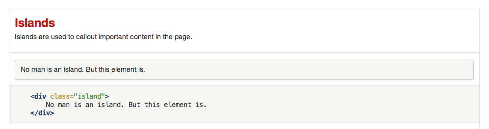
When implementing the front-end for the same feature, the developer doesn’t have to think about how to build that island from scratch. They can simply use the documented markup. No new css necessary.
This saves a lot of time and frees up mind space so we can stop thinking about what certain tabs should look like and instead focus on designing and building engaging user interfaces.
It’s alive, it’s alive!
Our patterns are documented in live production code, so what you see in the styleguide is exactly what you’ll see on the site. This is great for cross-browser testing our components and, unlike static design documents, there’s no need to worry about it becoming out of date.
We explored a number of options for live css documentation. An early version ran on PyKSS (the python flavor of Kyle Neath’s KSS), a framework for generating live styleguides from descriptions and markup in css comments. We enjoyed working with PyKSS, but ultimately chose to develop a custom solution. This allowed us to make use of existing partial templates. It also made it easier to provide code snippets that developers should actually include in templates, rather than the markup that those snippets output.
No component left behind
The styleguide makes cross site changes a breeze. Since development on the business listing page began, we’ve made several visual tweaks to our patterns. Our grays got warmer. Our islands lost their embossed look. The style was updated in one file and the changes were reflected everywhere the component was used, as well as in the styleguide.
See it in action
References
While creating our styleguide we took inspiration from a number of awesome sources:
- Creating Living Style Guides (Nicole Sullivan)
- Unifying Agile and UX with Live Style Guides (Grant Hutchins, Andrew Cramer, Steve Berry)
- Compose to a Vertical Rhythm (Richard Rutter)
- Front-end Style Guides (Anna Debenham)
- Atomic Design (Brad Frost)
Want to work closely with top-notch designers to build engaging user interfaces for 120 million monthly visitors? We’re hiring!