Animating the Mobile Web

-
Zain M., Engineering Intern
- Jan 27, 2015
One of the most engaging features of Yelp is our photos and videos gallery. When you visit a Yelp Business Page inside of the mobile app, there is a photo at the top of the page to provide visual context. It also serves as a compelling entry point to our photo viewer if you pull it down. We wanted to have this same effect on our mobile site, so we set out to develop a nice, smooth animation to pull down this photo and delight mobile web users with the same experience they’re used to on our mobile applications.

The Beginning
I was tasked with implementing this animation as part of my internship. Having little prior experience, all I knew was that when the user touches to pull down on the photo, its CSS properties should update over time to generate what is pictured above.
To feel smooth, this animation needs to run at 60 frames per second (fps). This sets our frame budget to 16ms. 16ms to perform all animation-related work necessary to render each frame: sounds like a challenge!
Scoping Out Animation
The first step was to place the background image behind the top of the page so that we can expand and scale it in the future.
After completing this, I started to manually test out how the image would expand and thought about which CSS properties were needed to accomplish the animation effect.
When the photo is being pulled down, several CSS properties should be animated over time:
margin-top, to control the photo’s top offsetopacity, to fade-in the photo as the user pulls down and to fade-out the rest of the business details page as the user pulls downheight/width, to scale the photo up as the user pulls down
Using Chrome Developer Tools I manually fiddled with the CSS properties of the respective DOM Elements to replicate the desired animation and after some experimentation, things looked okay. Still left to do: animate those CSS properties based on a user’s touch movements.
Handling Touch Movements
When researching about touch events, I learned that, on mobile devices, there are
three main events triggered when a user touches a screen: touchstart, touchmove, and touchend.
These three events enable JavaScript to see when and where a user’s finger starts, moves and stops. In our case, we care about the distance between their current touch point and their initial touch point.
Hence the following action plan to handle touch movements:
- On
touchstart: keep track of the initial y coordinate (let’s call itinitialY) and store it for future comparisons. - On
touchmove: get the current vertical coordinate (currentY) and compare: - if
currentY>initialY, the user is pulling down on the photo. In this case, (currentY-initialY) represents how much a user has pulled down thus far, and can serve as a basis for CSS properties updates (more on that later.) - if
currentYinitialY, user is trying to scroll normally - On
touchend: redirect the user to our photo viewer or animate the page back to its original state
After coding this, I started to test how well touch events integrate with the CSS animations.
Initial Test Results
As seen below, we were blowing through our 16ms frame budget, resulting in a significantly laggy and choppy animation.
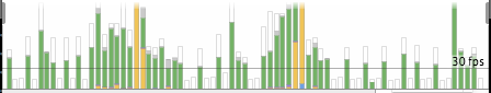
Two things are causing this:
margin-top,height, andwidthare poor CSS properties to animate. Since updates can’t be offloaded to the GPU, animating on any of these properties takes a heavy toll on the browser, especially on mobile.- Each touchmove event triggers the rendering of a new frame. This is too much rendering work for the renderer, which explain the frames dropped and the choppy animation. As Jon Raasch explains in a post on HTML5 Hub: “The renderer tends to choke on the large number of rendering tasks, and often isn’t able to render a certain frame before it has already received instructions to render the next. So, even though the browser renders as many frames of the animation as possible, the dropped frames still make for a choppy-looking animation, which is not to mention the performance implications of overloading the processor with as many tasks as possible.”
Animating Faster
To tackle the first problem of expensive CSS properties, I read Paul Lewis’ and Paul Irish’s post on High Performance Animations to find more efficient replacements.
Their post explained which CSS properties are best for animating on the web and lead us to use:
transform: translateY(), to control the photo’s top offsetopacity, to fade-in the photo as the user pulls downopacity, to fade-out the rest of the business details page as the user pulls downtransform: scale(), to scale the photo up as the user pulls down
In addition to using more efficient CSS properties, I promoted each DOM element taking part in this animation to its own layer by styling them with transform:translateZ(0). This is essential because it offloads rendering work to the GPU and prevents layout thrashing (since the animated elements are on their own layers, the non-animated elements don’t need to be re-laid-out/re-painted).
Animating Smoother
To prevent frames from getting dropped due to too many rendering requests, I used requestAnimationFrame. requestAnimationFrame takes a callback that executes when the browser pushes a new frame to the screen. Essentially, the browser pulls for work at each frame, instead of us pushing work for each new touch event. This allows for concurrent animation to fit into one reflow/repaint cycle. As a result, it makes animations look much smoother because the frame rate is consistent.
Problems solved but could implementation be better?
I had the essentials for a neat photo pull down animation. However, the animation was composed of several independent animations on different DOM elements. Manually computing CSS properties’ values at each frame was unnecessarily complex. I needed a more standard & organized solution to create and run DOM animations.
GitHub and Shifty to the Rescue!
I found on GitHub a tweening engine to abstract most of the difficulties of creating an animation, called Shifty, an open-sourced lightweight tweening engine for JavaScript created by Jeremy Kahn.
Using Shifty would provide us with:
- the calculation of CSS properties at a certain point in an animation, given a start/end value and a desired duration
- the ability to easily seek to a certain point in an animation
However, the things Shifty wouldn’t provide us were:
- the ability to directly apply the calculated CSS properties to specific DOM elements
- the ability to orchestrate multiple animations simultaneously
How can we build on top of Shifty to help us with our use cases?
As a result, I created two JavaScript classes which extend from the Shifty tweening engine.
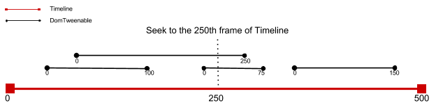
DomTweenable
The first class is called DomTweenable. It’s the same as a Tweenable object from Shifty except that you can attach additional DOM element to the Tween. Moreover, when you seek to a specific part of the DomTweenable’s tween, the CSS properties are automatically applied to the DOM element.
Timeline
The second class is called Timeline. Same as a Tweenable object from Shifty except that you can attach multiple DomTweenable objects at specific point in the Timeline’s tween. When you seek to a specific part of the Timeline’s tween, it seeks on each of the DomTweenable objects at (specified position - starting position on timeline.)
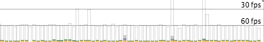
Final Result
We now have an easy way to animate on multiple DOM Elements and create smooth animations! And hey, look! Under 60 frames per second:
Thanks to Simon Boudrias and Arnaud Brousseau for the help!
Resources on animations