Designing the Android Navigation Drawer

-
Yoni D., Product Designer
- Sep 14, 2015
Since the dawn of time – or a very long time at least – the Yelp Android app has relied on a springboard design pattern for its navigation. This once-popular pattern served us well through the years as it allowed users quick access to Yelp’s most-used features. However, the design came with a series of trade-offs.
The Yelp Android app back in 2009 and 2011
Navigating Yelp is inherently a free-form action. Users may search for a business, look through some of that business’ reviews, then check Talk for the latest news in their community, before finally liking some of their friend’s Check-Ins. With the springboard design this meant backing out to the springboard before drilling down again on a regular basis.
Besides being cumbersome to navigate, it also provided an overwhelming first impression to new users. We aspired for our users’ first impression to be the amazing content created by their incredible peers, not just a grid of features. Given that we are also constantly adding great new features, it’s fair to point out that the springboard doesn’t scale well.
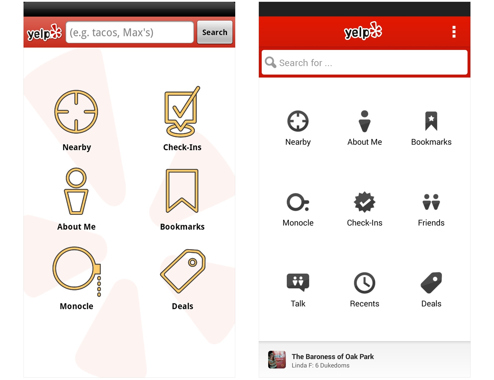
We started exploring the idea of a navigation drawer accessible from almost anywhere in the app. This would not only make navigating our app easier, it would also allow us to better focus our app through the hierarchy set in the menu. Presenting our users with rich nearby content would be achieved through the default collapsed nature of a drawer, defaulting to Nearby.
The new Yelp Android app
With more exploration we discovered a number of additional improvements we could make to the drawer. For example, highlighting our users’ core profile statistics evokes a sense of ownership and accomplishment. Surfacing contribution links offered both easy access for existing users while communicating the user-generated nature of our content to new users. And best of all, the bottom of the drawer provided us with an almost unlimited canvas to add a shiny new easter egg to our stable of platform mascots.
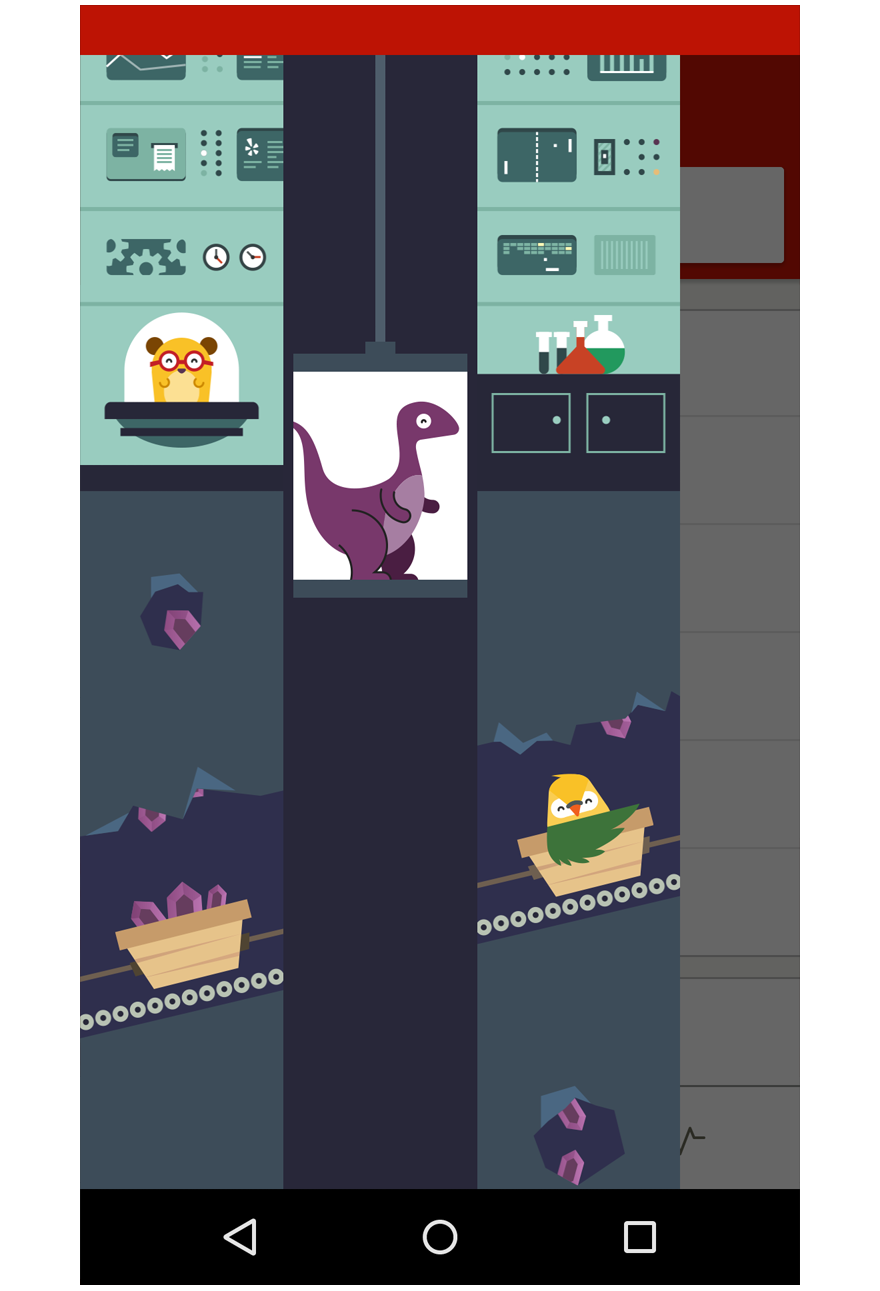
Yelp Android app easter egg
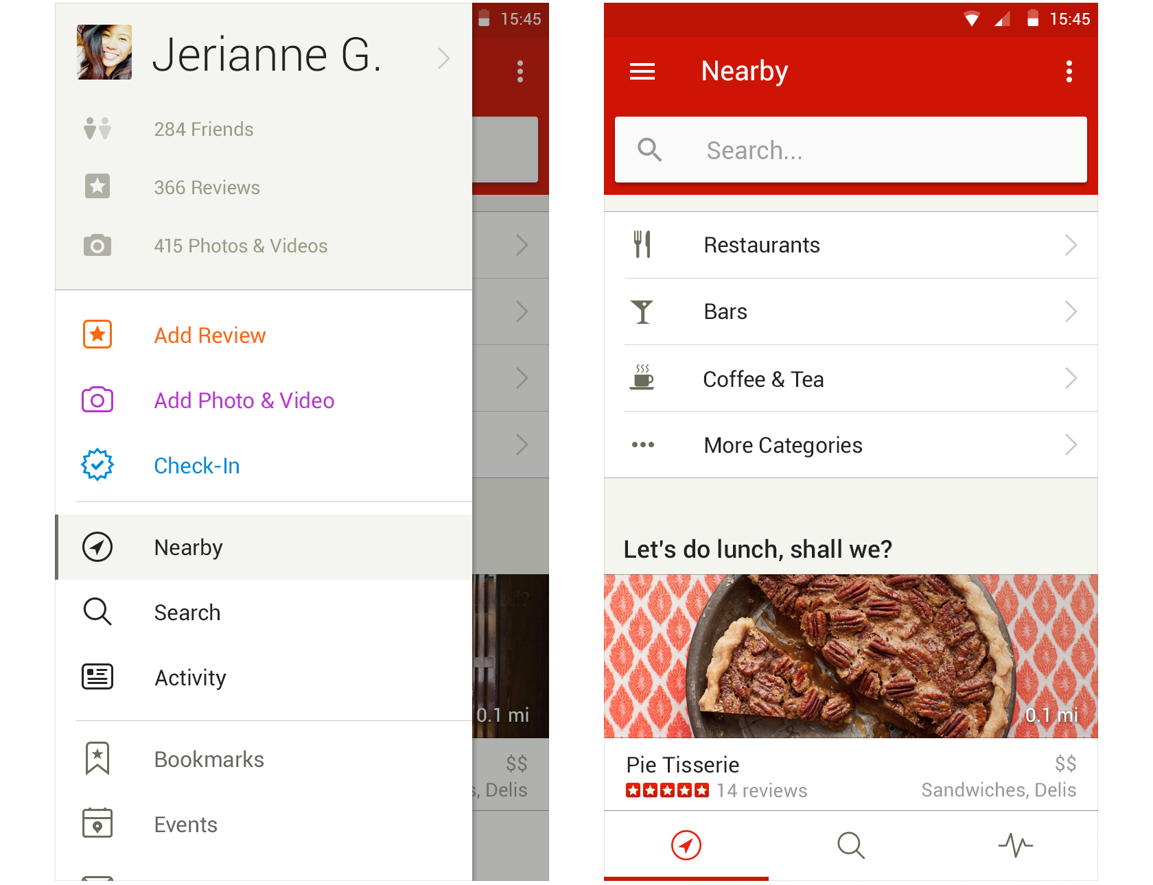
However, we weren’t done yet. We had gone from an app that revolved around too many features to an app that felt a tad shallow and oversimplified. Although the drawer hierarchy did a great job at emphasizing our core functionality, it did lack significance and impact. We were drawn to the idea of a persistent navigation that highlights Yelp’s most essential features (nearby discovery, search, community activity) and gives new users an idea of what the app’s core value is.
Yelp Android app persistent navigation
This impactful persistent navigation creates both an easier path to the most essential features while also representing the core value of Yelp. We think this will lead to greater retention of new users, but we also believe it’s just a better experience that’s more engaging for all users. Through a series of experiments and partial roll outs we released this new navigation paradigm into the wild.
It’s never a fun experience when an app you frequently use makes radical changes, even if they’re for the better. Because of this, one of our main concerns was the sentiment of our users. We also always try to be very thoughtful when it comes to how features look and behave on a specific platform.
We believe the specific visual identity of an operating system is both important part of the user’s identity as well as a great tool for ease of use. This is one of the main reasons why we didn’t simply copy the navigation we have on our iOS app.
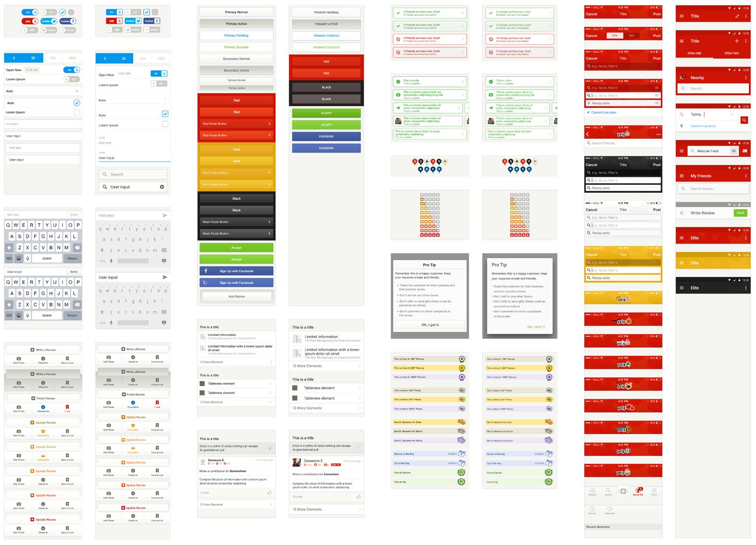
Yelp mobile patterns
Yet, working with a product as unique and complex as ours, we often find ourselves having to extend, modify and or even reinvent patterns set forth by operating systems. It’s often unclear if we did a great job until your users tell you they love or hate the creative liberties we took. Luckily, our users seem to love the changes we made. Especially the persistent navigation we introduced appeared to be very well received by our users.
Although we’ll always be iterating and experimenting with our navigation, this milestone has been an extremely rewarding project.
Join the Yelp Product Design Team
If our redesign of the Android navigation inspired you to design beautiful and functional products, apply to be a UI designer at Yelp!
View Job