How We’re Keeping Our Android UI Consistent

-
Nicola Corti, Software Engineer
- Oct 8, 2018

Every day, we ship the Yelp experience to millions of users through our website and mobile apps. Our design team is committed to shaping the best interfaces to make Yelp easier to understand and more practical for users. Writing a review should be as simple as searching for a restaurant or reserving a table on Yelp.
The Yelp experience must be consistent across all products and platforms where we ship our applications. For this reason, every app has to comply with our trusty Yelp style guide. This post will explain how we’ve built an Android library around our style guide and will focus on how we design, build, and share our reusable components.
Yelp’s Style Guide
The Yelp style guide (yelp.com/styleguide) is the source of truth that all designers, product managers, and developers use to build our elegant Yelp UI. It’s a collection of common patterns and components that makes frontend development easier and consistent on all fronts.
The style guide contains specifications about components, typography, illustrations, and color palettes used for both mobile and web applications. We like to think of it as the alphabet to Yelp’s visual language.
The Android style guide is the library responsible for implementing those design specs into real code. This library plays a critical role in our environment and dozens of Android developers rely on it every day. We pay special attention to making sure the components are accessible and also comply with our style guide.
Yelp’s Android Style Guide Library
The Android Style Guide Library (ASG) is a repository of components and resources available to every Android developer here at Yelp. To better understand this library, let’s start from scratch and focus first on how components are created. This process usually consists of three phases:
- API Design: Define how developers and designers will interact with the component.
- Build: Implement the component and make sure it’s in harmony with our ecosystem.
- Share: Ensure the component is reusable, documented, and frustration-free!
API Design
The API design phase defines the rules and interactions between our components and our client developers, and is the first step of the component lifecycle. In this phase, we define how flexible our components are and how we can expect developers to interact with them.
We’re pretty strict on this step because a method with the wrong visibility (say public) may result in a @Deprecated method that will end up polluting our codebase.
The first question we ask ourselves during this phase is, “Can it be reused?” And if so, how? Adding a new component to the shared library comes with some costs, especially since components have to be flexible and reusable. The ASG is not just a folder with a lot of Android custom views, but a collection of components with well defined use cases, and understanding those use cases is the first step to designing a solid component.
Attributes and Styles
The definition of attributes sparks a lot of discussion. In its simplest definition, an attribute represents a mutable property of a component. Adding more attributes means giving more freedom to developers and designers to edit the look-and-feel of each component. To make sure our library is consistent, we want to restrict the attribute set so that it provides only those that are absolutely needed.
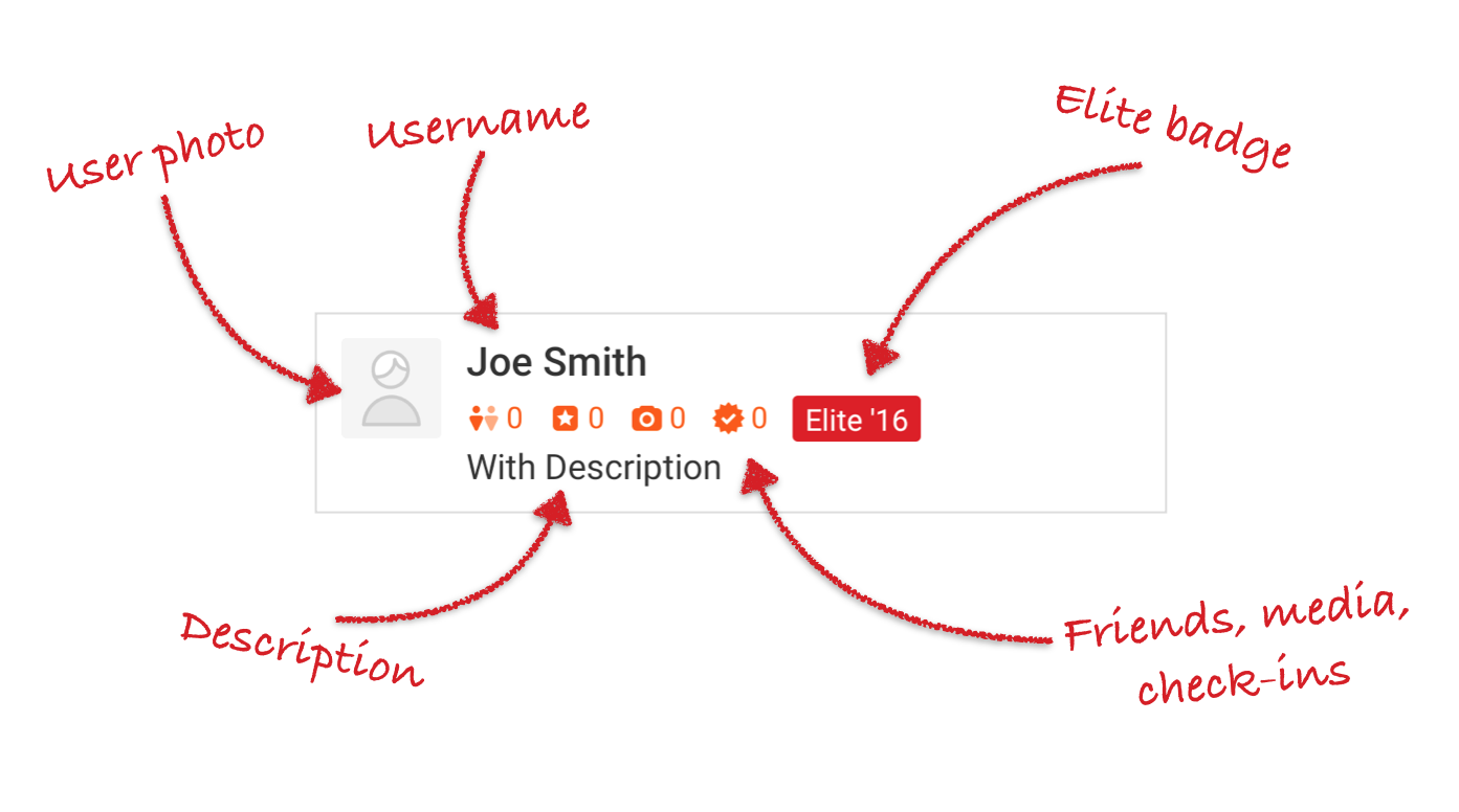
As an example, we can take a look at our user passport, a component used to display a user’s information in our Android app (e.g., on top of a review or next to an uploaded picture):

As we can see, there are several mutable fields in this component:
- User photo
- Username and description
- Elite badge
- Counter for friends, media, and check-ins
The above fields will be mapped into one or more attributes inside the library resource file. All attributes will be declared inside a <declare-styleable> block:
<resources>
   <declare-styleable name="UserPassport">
       <!-- Control user's name -->
       <attr name="user_passport_name" format="string"/>
       <!-- Control user's description -->
       <attr name="user_passport_description" format="string"/>
       <!-- Control color tint of the icons and icons count (default orange) -->
       <attr name="user_passport_tint" format = "color"/>
       ...
   </declare-styleable>
</resources>
Example 1: Defining attributes for the UserPassport component
We ensure that every attribute is usable from both XML and Java/Kotlin:
<UserPassport
   android:layout_width="match_parent"
   android:layout_height="wrap_content"
   app:user_passport_description="..." />
Example 2: Setting the description attribute from the XML
var description: CharSequence
   get() = descriptionTextView.text
   set(value) {
       descriptionTextView.text = value
       // .isGone is defined in Android KTX core
       descriptionTextView.isGone = value.isBlank()
   }
Example 3: The description attribute from the Kotlin code point of view
Occasionally, updating an attribute may trigger several side effects. In Example 3, we can see a setter for the description property. When setting an empty description, we also want to hide the TextView (updating the .isGone property).
This kind of logic should only live inside the setters for every attribute, and shouldn’t spread around the component code. This helps us keep our components clean and organized, and is practical since our components’ constructors share a common structure:
init {
   // Inflate the layout and retrieve the views.
   context.withStyledAttributes(
           attrs,
           R.styleable.UserPassport,
           defStyleAttr,
           R.style.UserPassport
   ) {
       description = getText(R.styleable.UserPassport_userPassportDescription) ?: ""
       // Other attribute initialization here.
   }
}
Example 4: A section of the UserPassport constructor; we’re also using Android KTX to keep our constructors clean and more idiomatic
We generally adhere to the following four steps: inflate the layout, bind the views, retrieve the attributes, and call the setters. In Example 4, we’re actually retrieving the attributes and calling the description setter at the same time.
We also need to define the component’s styles. A style allows us to fix a value for one or more attributes of a component. We want our components to come with a good set of styles to cover all major use cases.
First, we define a default style for every component. As the name suggests, this style will be applied by default whenever a component is used. As a result, developers won’t need to provide a value for all the attributes, just the desidered customizations.
On top of the default styles, we provide other styles to address each essential use case.
A good example is our UserPassport component and its styles. The .White style defines how the passport should look in a dark environment (like a media viewer). Thanks to the Android styles’ dot notation, the .White style will inherit all the attributes from the parent attribute (UserPassport in this case) so we don’t need to redefine all the values, but just override the one needed to obtain the desired appearance.
<!-- The default style for a User Passport -->
<style name="UserPassport">
   <item name="user_passport_tint">@color/orange_dark_interface</item>
   ...
</style>

<!-- White style, suitable to be used in combination with a Dark theme  -->
<style name="UserPassport.White">
   <item name="user_passport_tint">@color/white_interface</item>
</style>
Example 5: Two of our UserPassport styles
Defining attributes and styles plays a fundamental role in the API Design phase. When defining attributes, we are essentially defining the features of every single component. This will have a deep impact on how flexible our library is, and to which degree of freedom we want to provide the client developers.
Colors and Icons
When defining styles and attributes, we often have to fix colors and icons that will be used by our components. This step is very critical: assets and hex color strings can be lost among Slack messages, and exporting icons for every density and platform can be tough and can cause us to easily lose consistency.
To overcome these kinds of issues, we developed two tools to automate this process: Yelpdesign and Yelpicons.
Yelpdesign is a tool used to automate the handoff of designer “tokens.” A designer token is basically a constant that can be used by frontend developers, such as a color or a padding value. All tokens are bundled together into archives that can be consumed by every platform. E.g., for Android, we obtain an .aar containing a set of resource files.
Yelpdesign is the tool we use to convert the color palette defined in our style guide to a resource accessible from the Android environment. As you can see from the style guide website, we indicate which colors are safe to use for mobile and which will be exported in a colors.xml file.
![]()
Yelpicons is a tool used to automate the handoff of assets. Yelpicons works in a similar way as yelpdesign: illustrators upload SVGs to Yelpicons, which get bundled for every platform. For Android, assets are created for every density and placed in the proper drawable-*dpi folder.
You can read more about how we automate these process in this blogpost from our Yelp design team: Automating Consistency.
Build
Once the API for our component is defined, it’s time to implement and integrate it into the ASG library. When adding a new component, we want to make sure the component is well documented and tested. The component should also work well with the Android Studio’s designer preview tool. We ultimately want every widget to work out of the box with just a simple drag-and-drop action.
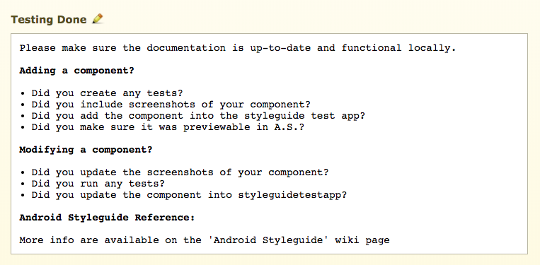
We want every developer contributing to the library to be aware of the impact of their pull requests. For this reason, we use a simple template to populate each pull request with a set of questions that every developer must answer (e.g., “Have you added tests?” “Have you documented your component?”). This could come off as a weak form of enforcement, but in actuality is already catching a lot of common mistakes and in the process, is educating developers on how to contribute.

The ASG library is hosted on its own repo and exposed to client developers as a maven artifact through our internal repository. We use semantic versioning to inform developers if the next release contains new components, bug fixes, or breaking changes.
Some of our components are designed to replace the Android framework component (e.g., we have a custom button). For those components, it’s good practice to write a custom lint check, which warns developers to use their style guided counterpart rather than the framework component.
Lint checks turn out to be really handy. Since they’re integrated into Android Studio, the developer’s code is immediately highlighted to mark the warning.

From our experience, lint checks are a great tool to advocate for new components.
Furthermore, they’re integrated into our CI system and run on every build. In our infrastructure, we set all the warnings as errors, and abort all builds that return errors. This means that a developer’s build will be broken if they don’t use the proper component. This approach could sound a bit stricter than necessary, but is actually a great way to encourage library usage.
Adding a new lint rule using such strict settings could sound hard. Let’s say that we add a new button with a lint check to raise a warning for every usage of a legacy button. We have hundreds of buttons in our codebase, so if we run this lint check, we will break the build for everyone. To overcome this problem, we use a lint baseline file. A baseline file is a snapshot of all the current lint warnings. Lint will check if the warning is contained in the file and suppress it if necessary. This allows us to add new lint checks easily and without breaking legacy code.
lintOptions {
   abortOnError true
   warningsAsErrors true

   lintConfig ("lint.xml")
   baseline ("lint-baseline.xml")
}
Example 6: One of our lint configuration blocks
Share
After we’ve coded the component and made sure it works properly within our infrastructure, it’s time to share it with the developer and designer community at Yelp. Lint checks are a great tool to enforce usage, but components should also be easy to find and use.
First, we need to provide proper documentation. Every component detail should be documented, in particular:
- Attributes and styles should be documented with an XML comment
- Classes should be documented with a KDoc/Javadoc
- Public methods should be documented with a KDoc/Javadoc comment
We use Dokka to build our documentation from the Kotlin/Java files. The generated documentation will then be populated with comments from the XML to make sure all attributes/styles/code/methods are on the same page for every component. This will allow every developer and designer to understand the particular capabilities of each individual component.
Someone once said “A picture is worth a thousand words.” This is why we also include several screenshots with every component to aid in understanding the different styles and attributes of each one. They’re also a great tool to improve discoverability and are added to the same widget page.
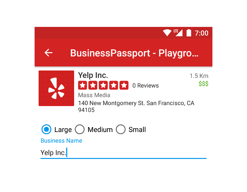
Finally, we also developed a small companion app called the styleguide test app. This application is a repository with a list of all available components. This is the best tool to see all of our components in action, and especially to appreciate all the animations and see how they actually look on a real device. Our test app is also rich with playgrounds that designers can use to see how every attribute change transforms the component.

Conclusion
In this blog post, we presented our Android Style Guide Library, a collection of reusable components used by our Android developers. We followed the lifecycle of every single component to better understand how to fix the nitty gritty details and build great, reusable components. While building a components repository is no easy task, we’re deeply committed to achieving our final goal: providing a solid and consistent Yelp experience to our users!
Software Engineer - Mobile Android
Come join us in helping build an awesome Android experience at Yelp
View Job