Migrating from Styleguidist to Storybook

-
Kedar Vaidya and Benson Pan, Software Engineers
- Jul 6, 2022
One of the core tenets for our infrastructure and engineering effectiveness teams at Yelp is ensuring we have a best-in-class developer experience. Our React monorepo codebase has steadily grown as developers create new React components, but our existing React Styleguidist (Styleguidist, for short) development environment has failed to scale in parallel. By transitioning from Styleguidist to Storybook, we were able to offer a faster and more user-friendly development environment for React components along with better alignment to developer and designer workflows. In this post we’ll take a deep dive into how and why we migrated to Storybook.
Background
Status Quo
Styleguidist is an interactive React component development environment that developers use to develop and view their user interfaces. Styleguidist can also be used to produce static documentation pages (style guides) that can be hosted and shared with stakeholders.
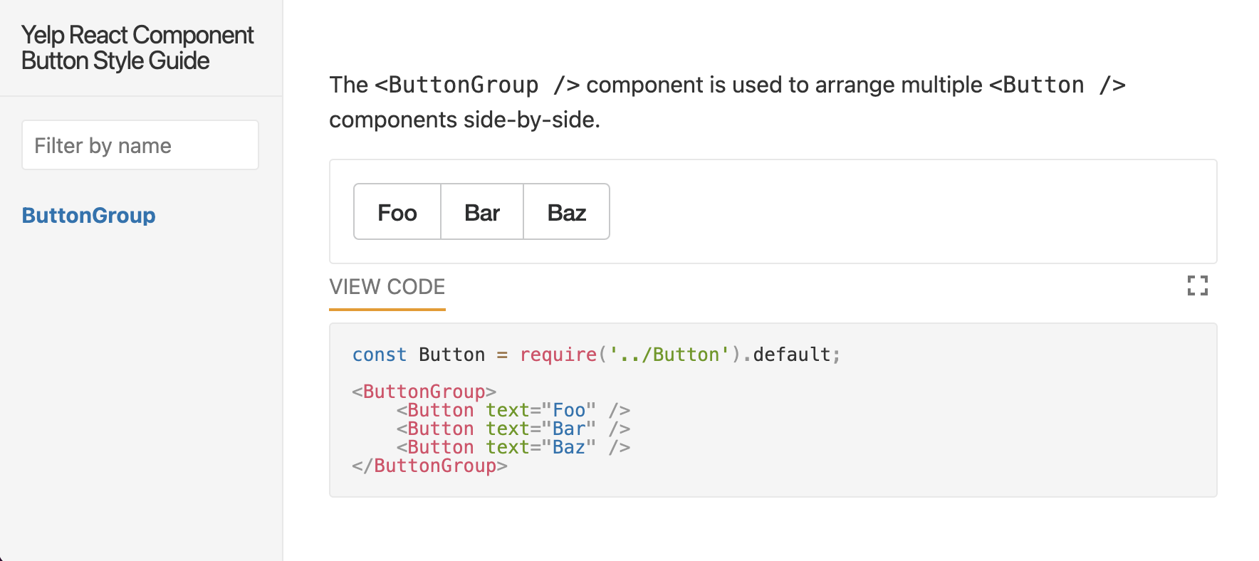
Documentation is created using Markdown with code blocks that render a React component in an isolated interactive playground. A simple example looks like the following:
The `<ButtonGroup />` component is used to arrange multiple `<Button />`
components side-by-side.

```jsx
const Button = require('../Button').default;

<ButtonGroup>
    <Button text="Foo" />
    <Button text="Bar" />
    <Button text="Baz" />
</ButtonGroup>
```

An example Styleguidist playground
At Yelp, we’ve encountered various drawbacks from using Styleguidist that have led to a subpar React development experience:
- Styleguidist lacks an add-ons ecosystem due to a lack of wider Web community support, so additional functionality in Styleguidist would have to be written from scratch.
- Styleguidist does not scale well with large packages because it renders an isolated playground for every example in that package, resulting in slow initial load times and slow hot reloads.
- Developers have to create many permutations of each of their components to show every possible state a component supports.
- Editing Styleguidist markdown to change component state in the UI is not intuitive for developers and non-technical users.
Why Storybook?
Storybook is an open source UI development and documentation tool that has gained popularity in the Web community in the past few years. It has strong community support and a rich add-ons ecosystem, making it easy to extend for accessibility testing, cross-browser testing, and other functionality.
Storybook allows users to browse and develop component examples one by one via Stories. Stories capture the rendered state of a React Component, just like a Styleguidist Markdown example. This contrasts with the significantly slower Styleguidist, which always renders every example of every component in a package.
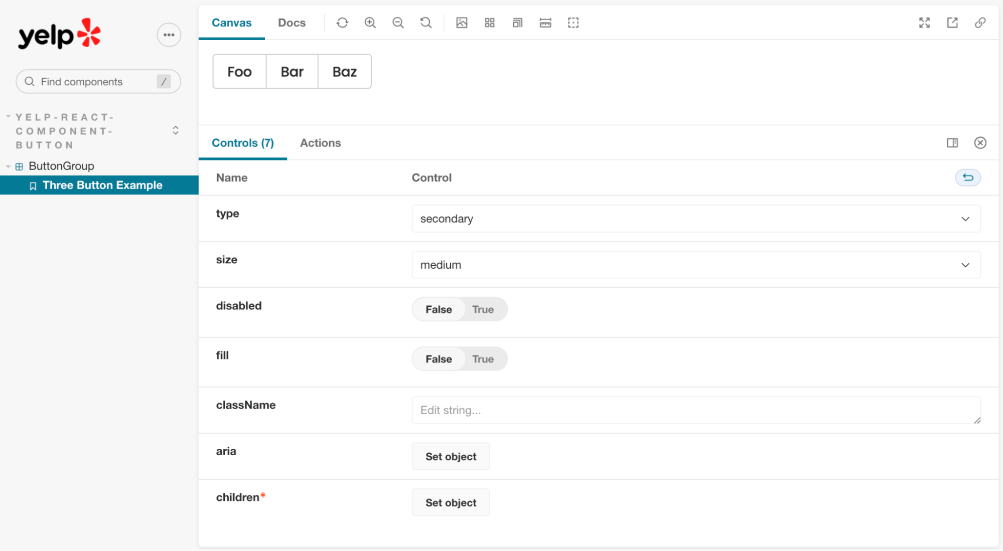
In Styleguidist, developers often create one example per visual permutation of their component, resulting in added maintenance burden (e.g. updating every example after changing a component API). In Storybook, developers can utilize auto generated Controls via react-docgen that allow users to mutate and preview components directly in the documentation UI. This further streamlines the experience compared to Styleguidist, because documentation users no longer need to edit Markdown to change a component’s state.

An example Storybook playground
The Migration
Our React monorepo contained thousands of Styleguidist files, each with many examples of component usage within it. It was not feasible to migrate these by hand, and it would be unreasonable to force developers to manually rewrite their examples in the new Storybook format. To maintain our existing React component examples and reduce developer overhead in our migration, we developed the following requirements:
- Our existing Styleguidist files used ES5 style imports and syntax. We want to keep our new Storybook syntax consistent with component source code by using ES6 everywhere.
- Documentation in Storybook should be familiar to developers who have used Styleguidist.
- Storybook supports MDX which is a file format that combines Markdown with JSX to render React components in Markdown for documentation pages, and we can translate existing Styleguidist Markdown to MDX.
- Each example code block in Styleguidist should be translated into a Story, and the component’s stories.js file should contain all examples.
With these goals in mind, we decided to use codemods to refactor our style guide files into the Storybook format. Codemods are a series of scripted actions that transform a codebase programmatically, and allow for large automated changes to be made without manual work.
First we extracted the Styleguidist code blocks; the rest of the contents of the Markdown file (e.g. plaintext descriptions) could be directly copied verbatim to the new MDX file. To achieve a one to one migration, we consider each code block as its own Story. We were able to leverage existing tools like remark-code-blocks to extract Javascript codeblocks, and 5to6-codemod to convert ES5 syntax within these codeblocks to ES6 syntax.
// before:
// const Button = require('../Button').default;
import Button from '../Button';
To reduce developer friction during this transition, we decided to contain all Stories for a component in the same component.stories.js file, which is then displayed in the component.stories.mdx Docs Page. However, we discovered that MDX code blocks are run in the same context, and our assumption of maintained playground isolation from Styleguidist is no longer true. This issue is particularly problematic when dealing with transforming multiple Styleguidist examples in the same file, because joining the code blocks together results in duplicate imports:
```jsx
import Button from '../Button';

Full width `ButtonGroup` example:
<ButtonGroup fill>
(omitted for brevity)
```

```jsx
import Button from '../Button'; // <-- this import is duplicated from above!

Disabled `ButtonGroup` example:
<ButtonGroup disabled>
(omitted for brevity)
```
After combining the above stories into a single JS file, the Button import is duplicated. Our codemod needs to parse and dedupe these imports to prevent runtime errors. Additionally, we need to include the components that Styleguidist implicitly imports for us:
// ButtonGroup.stories.js
import Button from '../Button'; // deduped
import { ButtonGroup } from './'; // added implicit import explicitly

<ButtonGroup>
    <Button text="Foo" />
    <Button text="Bar" />
    <Button text="Baz" />
</ButtonGroup>
Next, we write the extracted Markdown code blocks with deduped imports and ES6 syntax in component.stories.js, and a component.stories.mdx file with standard Storybook boilerplate:
// ButtonGroup.stories.mdx
import { ArgsTable, Canvas, Description, Meta, Story } from '@storybook/addon-docs';
import * as stories from './ButtonGroup.stories.js';
import { ButtonGroup } from './';

<Meta
    title="yelp-react-component-button/ButtonGroup"
    component={ButtonGroup}
/>

The `<ButtonGroup />` component is used to arrange multiple `<Button />`
components side-by-side.

<Canvas>
  <Story name="Example0" story={stories.Example0} />
</Canvas>
Lastly, we needed Storybook to understand how to build our components. We were able to extend the Storybook build configuration with our existing production webpack configuration. This allowed us to preserve Storybook’s automatic docgen functionality, and miscellaneous features like code preview blocks. Using our existing webpack configuration also meant that components would appear and behave exactly as they do in real production pages.
Conclusion
Migrating our React component examples from Styleguidist to Storybook has massively improved developer experience and component playground performance. We were able to utilize Storybook features like on-demand loading to improve performance by generating a smaller bundle at compile time, resulting in faster playground boot times. Using our codemod migration strategy, we were able to transform nearly all of the examples in our monorepo without runtime errors, without blocking developers during the migration process.
Switching to Storybook opens up new possibilities for Yelp, and we’re excited to onboard add-ons to accelerate frontend developer productivity further.
We hope that this breakdown in our migration process helps teams facing similar migrations!
Become an Engineer at Yelp
Want to help us make even better tools for our full stack engineers?
View Job