Mission: Beyond The Mobile Browser

-
Arnaud Brousseau, Software Engineer
- Jan 22, 2013
Last year we published an article explaining the reasoning behind the birth of our mobile site, Mission: Mobile Makeover. Since then, we’ve been hard at work, dedicated to improving this new Yelp property and transform it into an app-like experience. Ideally? Forget about your browser, and keep on Yelpin’!
Today, we’ll focus on some of the work we’ve accomplished during the past year or so. We’ll talk about two technical challenges faced lately: how to boost interaction speed on mobile, and how to make the most out of the screen sitting in your pocket.
Boosting Interaction Speed
Clicks are a core concept on the web because it drives most form interactions and navigation. To support double clicking, mobile browsers have no choice but to wait a short amount of time (typically, around 300ms) after your finger has lifted off the screen to fire a click event.
Since Yelp’s mobile site doesn’t require double clicks this behavior is actually detrimental to us: it makes interactions and navigation feel slower. That’s why we decided to boost interaction speed with a global shim that mitigates the delay that a user typically experiences between the moment when her finger lifts off the screen and the moment when a click event fires in JavaScript.
The general principle behind the change is:
If a user triggers a
touchstartevent at point A, followed by atouchendevent at point B and if the two points are not far away from each other (both in distance and time), then it’s safe to assume we have a click intent. Otherwise, the intent was a drag, or something entirely different…but definitely not a click!To accomplish this, we listen totouchstart,touchmoveandtouchendevents. If we spot a click intent when atouchendevent is fired, we immediately trigger aclickevent via JavaScript and prevent the default action. As a result, theclickevent fires ~300ms earlier than it would otherwise have.
If we fail to spot a click intent (maybe touchstart and touchend events were too far away from each other in distance, which means we have a dragging movement), we simply let the browser handle things for us.
Quick notes about this:
- This idea is not new. Google has a really good article about it, mobile HTML5Boilerplate has fast buttons in its JavaScript helpers, and the Financial times app recently open sourced their solution for faster clicks on touch-enabled devices.
- Not all devices have this problem. In our experiments, we noticed that the latest Android devices handle touch events and clicks much faster than they used to.
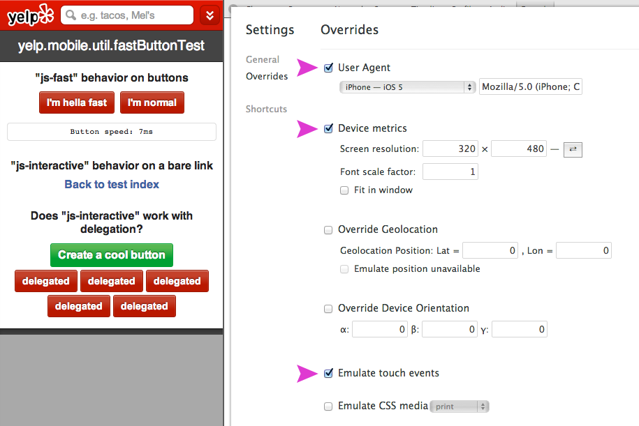
- If you want to implement fast buttons on your own, we highly suggest that you develop in Chrome Canary. This browser lets you emulate touch events, and also override a bunch of browser properties like the browser’s UA, width, height, etc. For example, here’s a screenshot of the setup used at Yelp to iterate on faster clicks:
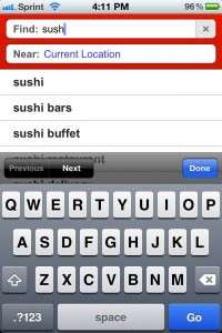
Above is a picture of search suggestions on Yelp’s mobile site. This is the quintessential example of a feature that needs fast interactions to exist. With delayed clicks (on form inputs and suggestions) the experience would feel sloppy and awkward. With faster clicks, we’re getting closer to an app-like experience on Yelp’s mobile site.
Making The Most Out Of Small Screens
Let’s take a look at our search map page:
This page has several fixed height parts (3 action bars, search form) and one dynamic height part (the map).
Since our mobile site is going to be displayed on a small screen, we have to take advantage of every pixel we can get. That yields two independent goals:
- Get as many available pixels as we can
-
Use 100% of the available space to draw content The first goal is difficult because the available space to display your Web app is typically dependent on the OS. When working inside a browser, there’s only one thing you can kick out of the way: the browser chrome (containing the URL bar). Getting rid of it is pretty simple: we have to tell the browser to scroll to the top of the page. It’s a well-known trick, and the code fits on one line:
window.scrollTo(0, 0);
There is a catch though: Android won’t work with the code above, and requires a slightly different version:
// For Android
window.scrollTo(0, 1);
Now comes in the hard part: we have to draw our layout (containing both fixed and flexible height parts) on the available screen. The only flexible part is the map so it’s going to fill whatever space we have left after placing the fixed height elements:
var mapHeight = screenHeight - totalFixedHeightsFromOtherElements;
We know the value of totalFixedHeightFromOtherElements. However we don’t know screenHeight. How tall is the screen exactly? How can we do that in JavaScript? Well, there are a lot of different APIs out there. See for yourself:
window.innerHeightwindow.outerHeightscreen.heightscreeen.availHeightpageYOffsetdocument.body.clientHeightdocument.body.offsetHeightdocument.documentElement.offsetHeightdocument.documentElement.clientHeight
Given the plethora of options available we took several devices, did some testing and iterated to come up with a solution. The code we are using right now looks something like this:
var width = screen.width;
var height = screen.height;

if (screen.width > window.innerWidth) {
    height = document.documentElement.clientHeight;
    width = document.documentElement.clientWidth;
}
This code is not pretty to look at but it solves the problem at hand — client-side screen size detection — pretty well for us. Let’s see why.
First, we found that screen.width/height was the most consistent API out there considering the devices we support (iOS and Android > 2.2). If you want to scare yourself, please have a look at the massive testing table James Pearce assembled! You will get a sense of how fragmented mobile devices/browsers are these days.
The code snippet above solves another problem: some devices report screen.width/height in physical pixels where others report it in CSS pixels. This matters for devices with double density display. For instance the Nexus 7 reports a screen.height of 1280px.
However, document.documentElement.clientWidth always reports a value in CSS pixels, so we fall back to that API if we spot that screen.width/height is giving us a bigger value than expected.
Why don’t we use document.documentElement.clientWidth all the time then? You guessed it already: it’s not accurate enough, for instance on iOS (it reports 356px instead of the expected 480px because of the browser and system bars).
As you can see this complex problem doesn’t have a definite answer. We’re still iterating on our solution at the time of writing.
By the way you’ll probably find surprising things if you fire up real devices. For instance did you know Nexus7’s reported devicePixelRatio was 1.3250000476837158? Yup, that’s insane.
Going forward
The mobile site is still a young Yelp property. Barely out of its infancy, actually. Since its introduction we’ve been busy working on delivering the best experience for small screens, trying to make you forget you are in a browser.
Fostering faster touch interaction, giving better feedback, making the most out of every available pixel, taking advantage of new HTML5 APIs… this is barely scraping the surface of the ideas we have to improve our mobile site going forward.
We are truly excited about what’s ahead. If you are too, you should think about joining us — we’re hiring ;)


