Building a server-driven foundation for mobile app development

-
Joshua Walstrom, Group Tech Lead, Yelp for Business Mobile Apps
- Nov 30, 2021
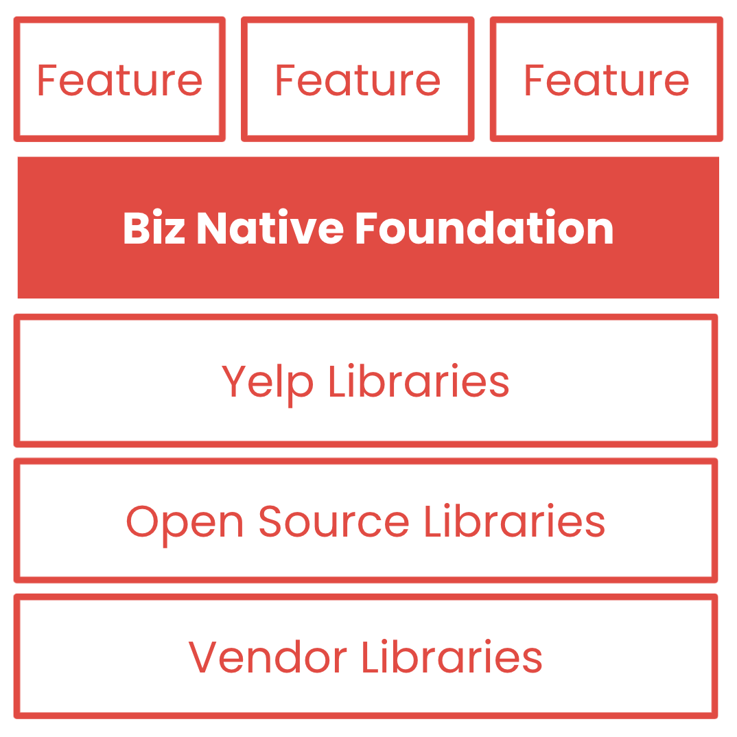
Yelp has many teams of mobile developers who collectively maintain two different mobile apps on iOS and Android: Yelp (hereinafter “Consumer App”) and Yelp for Business (hereinafter “Biz App”). We’re always looking for ways to ship features more quickly and consistently on all these platforms! We adopt vendor and open-source libraries when possible, and we develop our own shared libraries when necessary. While many teams were already independently adopting server-driven UI (SDUI) to build their features faster and cheaper, we felt something was missing – a foundation that tied all our libraries together into a shared, server-driven, end-to-end solution for mobile features.
In this blog post, we’ll cover the Biz Native Foundation (BNF), which provides a foundation for building, testing, deploying, and monitoring server-driven features in our Biz App. At the end, we’ll share future plans for extending this foundation to our Consumer App.
What is the Yelp for Business mobile app?
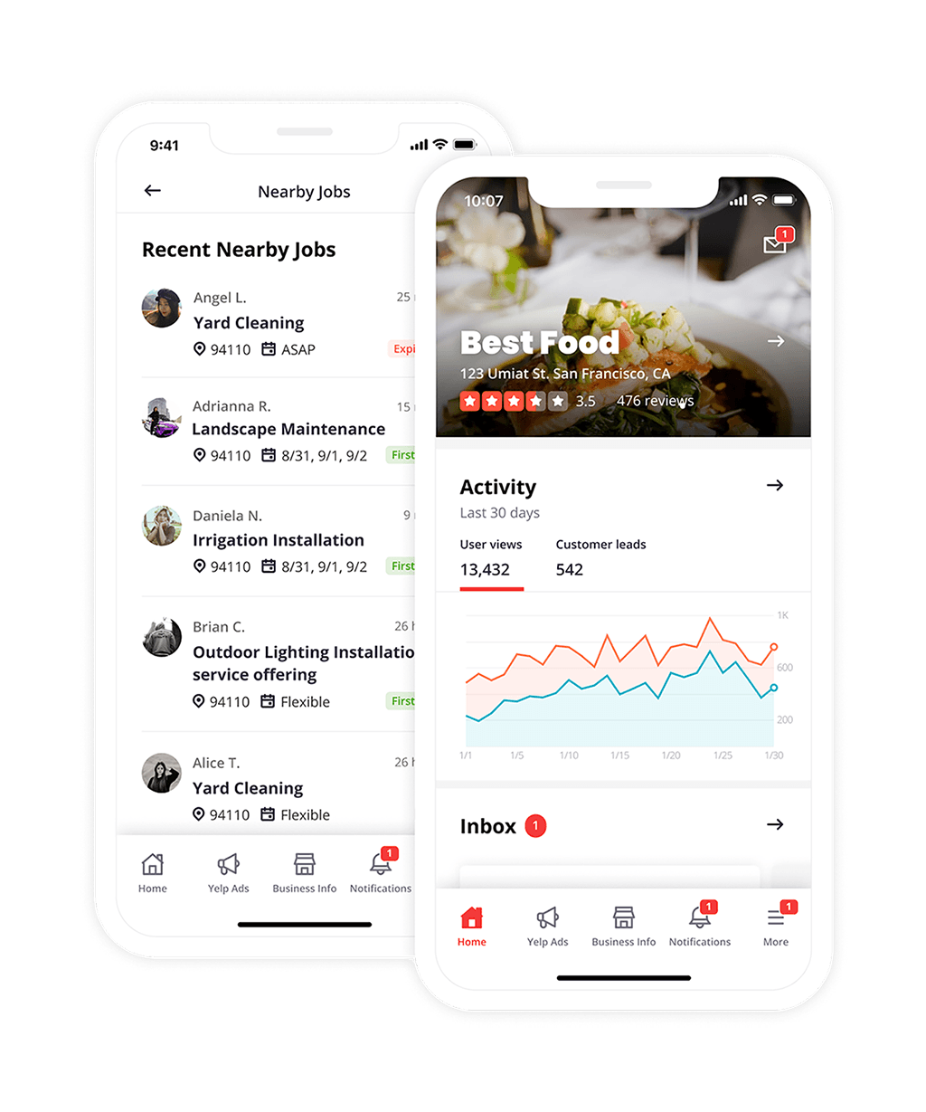
Launched in December 2014 for both iOS and Android, our Yelp for Business mobile app enables businesses to manage their presence on Yelp and connect with customers from their phone.
The app has several core screens, or tabs, with highly personalized content for each business and app user. For example, a restaurant that opened during COVID-19 will have different needs than a firmly established plumber, and a business owner will have different needs than a manager or employee. The core screens link to secondary screens for updating business information, adding photos, responding to reviews, and finding new customers.
Developing both iOS and Android versions of a complex, personalized app has been a major challenge. The level of effort to ship a new feature can be high, and the time-to-market can range from a minimum of one week (we release our apps weekly) to several months or quarters. Once released, a feature must be supported in a range of app versions while undergoing continuous maintenance and improvements with each new release.
Server-driven UI (SDUI) was an obvious way to address these challenges, and many product teams had already adopted SDUI or were planning to adopt SDUI in 2019 when we began developing the BNF to standardize and simplify mobile development. The COVID-19 pandemic accelerated our efforts as we added features to help businesses navigate an extremely dynamic, challenging time. We realized we needed to make a significant investment in order to adopt SDUI across our entire app.
Business and Technical Requirements
We defined a handful of important business and technical goals for our foundation:
- Ship Biz App features more quickly and consistently on iOS and Android
- Reduce the level-of-effort required to build, test, deploy, and monitor new Biz App features
- Support dynamic, highly-personalized content
- Give our marketing and product teams more direct control over the content in the Biz App
Alternatives Considered
Before we began building our own foundation, we reviewed a couple alternatives:
Webviews
The Biz App was already using webviews to share content with our Yelp for Business web app (biz.yelp.com). That said, we’d been slowly migrating away from webviews for the past two years for several reasons:
- Webviews require careful handshaking between native and web apps
- Most mobile app engineers don’t have experience debugging web apps, and most front-end engineers don’t have experience debugging mobile apps
- Native screens offer superior user experience (UX) over webviews, e.g. they are faster and more tightly integrated with the platform
React Native
React Native would allow us to ship mobile app features more quickly and consistently, and our front-end developers could contribute to our mobile app more easily. React Native would be faster than webviews and more tightly integrated with the platform. However, React Native had some significant downsides for our existing Biz App and developer community:
- We didn’t already use React Native at Yelp, and most of our mobile developers didn’t have professional React Native experience
- We couldn’t reuse our existing code or native libraries without extensive bridging, which feels counter to building a foundation
Design Principles
Once we decided to build our own foundation, we established some design principles to guide our efforts.
Adopt Best Practices
We would adopt Yelp-specific or industry-standard best practices when possible. Yelp already has consistent vendor, open-source, and internal libraries for mobile development. We use the latest features in UIKit (iOS) and Material Design / Jetpack (Android). On Android, we use our open-sourced Bento framework to build modularized UIs. On iOS, we have a similar internal framework. We wanted our foundation to build on these existing solutions rather than replace them.
Support Server-Driven UI (SDUI)
We would give our backend more control over screen content through server-driven UI. This would enable us to make changes more quickly and consistently on all clients. It would also enable dynamic, personalized content and give our marketing and product teams more direct control. Fortunately, SDUI wasn’t new to Yelp or the Biz App, where several product teams had already adopted SDUI for their features. We would learn from these efforts to create a shared SDUI framework for our foundation.
Enable Customization
We would enable customization. Though we wanted to encourage reuse and consistency, we didn’t want to restrict product teams from writing custom code where it makes sense. Otherwise, they would simply build their features without the foundation.
Create a Supporting Toolchain
We would create tools that simplify or automate common tasks, such as debugging, testing, logging, monitoring, and documentation.
Core Concepts
The BNF has only four core concepts to keep the system simple and intuitive. Since mobile screens are the heart of every application, the BNF provides a generic screen that hosts generic components. When the user interacts with generic components, we trigger generic actions to update the UI or applications state, using generic properties to provide a way for generic components to observe application state without strong coupling.
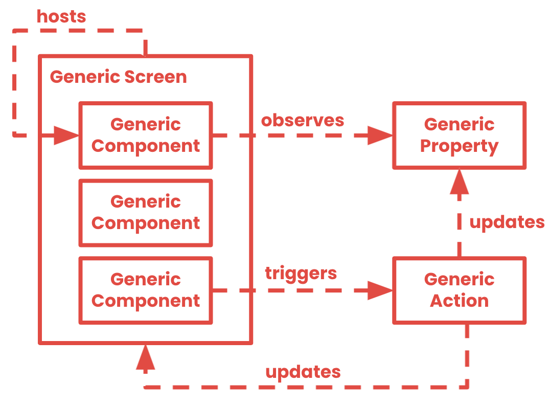
We’ll go through these concepts and show how they all work together to support mobile feature development.
Generic Screen
A generic screen is a flexible template that can support any screen in the Biz App. Before the BNF, adding a new screen required boilerplate code, such as a custom view controller (iOS) or activity/fragment (Android). Fortunately, mobile screens are constrained by the geometry of mobile devices, so we created one highly configurable screen.
A generic screen consists of a number of sections containing one or more generic components. Each section represents a part of the screen, such as the top/bottom navigation bar or scroll view.
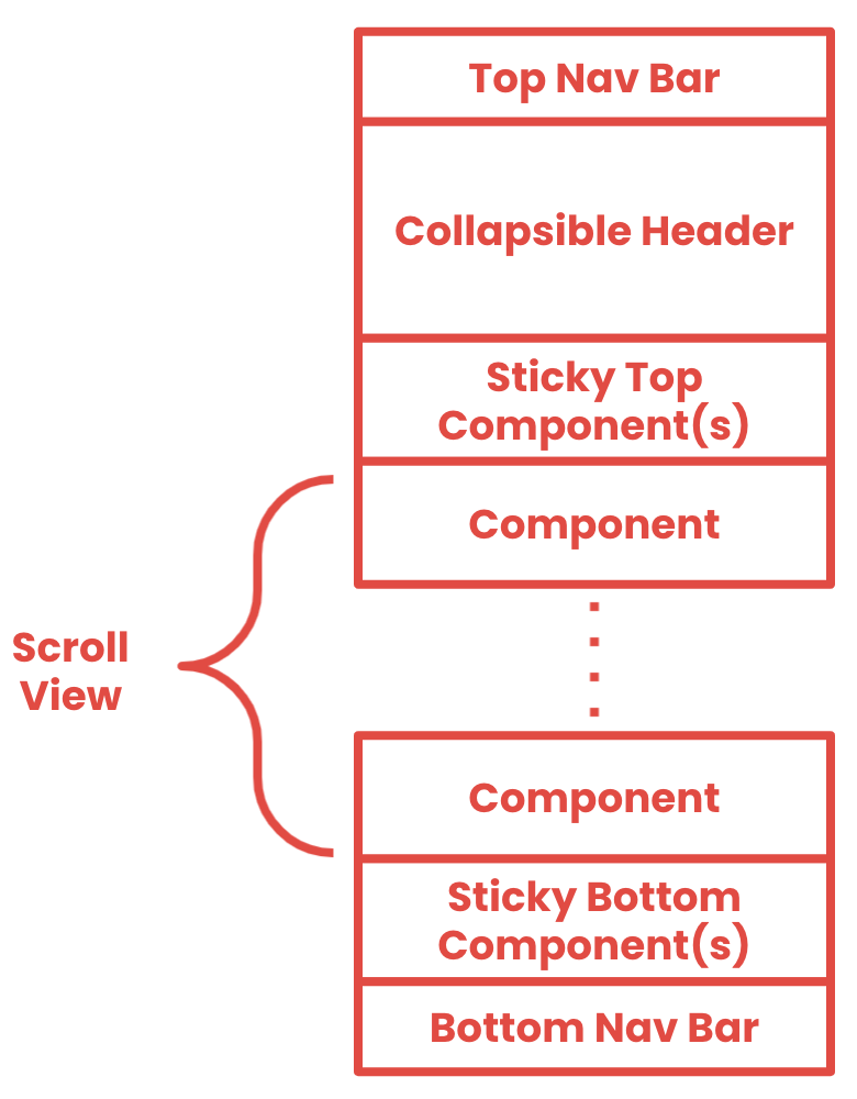
A generic screen must be configured to display content. The BNF supports both remotely and locally configured screens.
Remotely configuring a generic screen (SDUI)
A remotely configured generic screen uses an endpoint on our REST API to load a JSON screen configuration resource:
/ui/{business_id}/screens/{name}/configuration/v1
The endpoint has path arguments that specify the target business ID and the logical name of the screen, e.g. home.
We use Swagger 2.0 to document our REST APIs and auto-generate client networking libraries. Let’s look at some definitions for our screen configuration.
The screen configuration object (ScreenConfigurationV1) has properties for each section on the screen, e.g. components is the main scroll view. We version the screen configuration object and the screen configuration endpoint whenever we add new properties to this object, such as a new section.
ScreenConfigurationV1:
  properties:
    header:
      $ref: #/definitions/GenericComponent
    components:
      type: array
      items:
        $ref: #/definitions/GenericComponent
    sticky_bottom_components:
      type: array
      items:
        $ref: #/definitions/GenericComponent
    data:
      $ref: #definitions/GenericScreenData
  required:
  - components
  - data
  type: object
Each section can be configured with one or more generic components. The GenericComponent object only contains an ID (learn-more-button) and a type (generic_button_v1).
GenericComponent:
  properties:
    id:
      type: string
    type:
      type: string
  required:
  - id
  - type
  type: object
The data for each component is stored in a separate GenericScreenData object that maps a component ID to a GenericComponentData object, which was our best approximation for a Swagger union type that worked with our Swagger codegen pipeline, which automatically generates networking code for iOS and Android clients. GenericActionData plays a similar role for generic actions.
GenericScreenData:
  properties:
    id_to_component_data:
      description: Map component ID to its GenericComponentData
      $ref: #/definitions/IdToGenericComponentData
    id_to_action_data:
      description: Map action ID to its GenericActionData
      $ref: #definitions/IdToGenericActionData
  required:
  - id_to_component_map
  - id_to_action_map
  type: object

GenericComponentData:
  properties:
    generic_button_v1:
      $ref: #definitions/GenericButtonDataV1
    generic_text_v1:
      $ref: #definitions/GenericTextDataV1
    ...
  type: object

GenericActionData:
  properties:
    generic_open_url_v1:
      $ref: #definitions/GenericShowOpenUrlV1
    generic_close_screen_v1:
      $ref: #definitions/GenericCloseScreenV1
    ...
  type: object
There are some benefits to storing configuration data separately from references:
- We can reuse the same data across multiple references, reducing the size of the screen configuration
- We can debug the screen configuration more easily with all configuration data in a flat map
Locally configuring a generic screen
A locally configured generic screen uses either a Kotlin or Swift domain-specific language (DSL).
screenConfiguration {
    header {
        navBar(title = "Welcome!")
    }
    components {
        text("Yelp is working on some cool things!", style = HEADER1)
        button(
            "Learn more on our blog",
            tappedActions = actions {
               openUrl("https://engineeringblog.yelp.com")
            }
        )
    }
}
Though locally configured screens can’t be updated without a client release, they still satisfy many of our requirements, such as shipping features more quickly and reducing the level-of-effort. Not every screen has dynamic, personalized content that benefits from being server-driven, and some screens are simply hard to make server-driven.
Generic Components
A generic component is a basic building block for a generic screen. The BNF supports a rich, extensible library of components.
Every component has an unique ID and type. We use a naming convention to distinguish generic, reusable component types (generic_button_v1) from components that are customized for one feature (feature_ad_preview_v1). However, the BNF doesn’t handle generic or feature-specific component types differently, so we refer to all components as generic components.
Configuring components
Generic components must be configured with data. In remote screen configurations, each component type has an associated data object. When adding new features to the component, we always version the component type and data object.
definitions:
  GenericButtonDataV1:
    properties:
      text:
        type: string
      style:
        type: string
        enum:
        - primary
        - secondary
        - tertiary
      size:
        type: string
        enum:
        - standard
        - large
        - small
      viewed_actions:
        description: Actions to fire when the app user views the button
        type: array
        items:
          $ref: #/definitions/GenericAction
      tapped_actions:
        description: Actions to fire when the app user taps the button
        type: array
        items:
          $ref:#/definitions/GenericAction
    required:
    - text
    - style
    - size
    - tapped_actions
    type: object
In a local screen configuration, the generic component can be configured with our DSL:
button(
   text = "Learn more on our blog",
   style = PRIMARY,
   tappedActions = actions {
      openUrl("https://engineeringblog.yelp.com")
  }
)
Both produce the same result on the client:

Composing components
The BNF has several ways to build larger components from smaller pieces. First, many mobile features can be broken into a vertical stack of simpler components, such as buttons, text, icons, and images. Second, many features can be built by composing components with a container component.
For example, the Biz App has cards to promote the products and services Yelp offers to businesses. The promotional cards are built from a stack of simpler components and a bordered container (generic_bordered_container_v1), which contains a feature-specific component for each product (feature_call_to_action_v1).
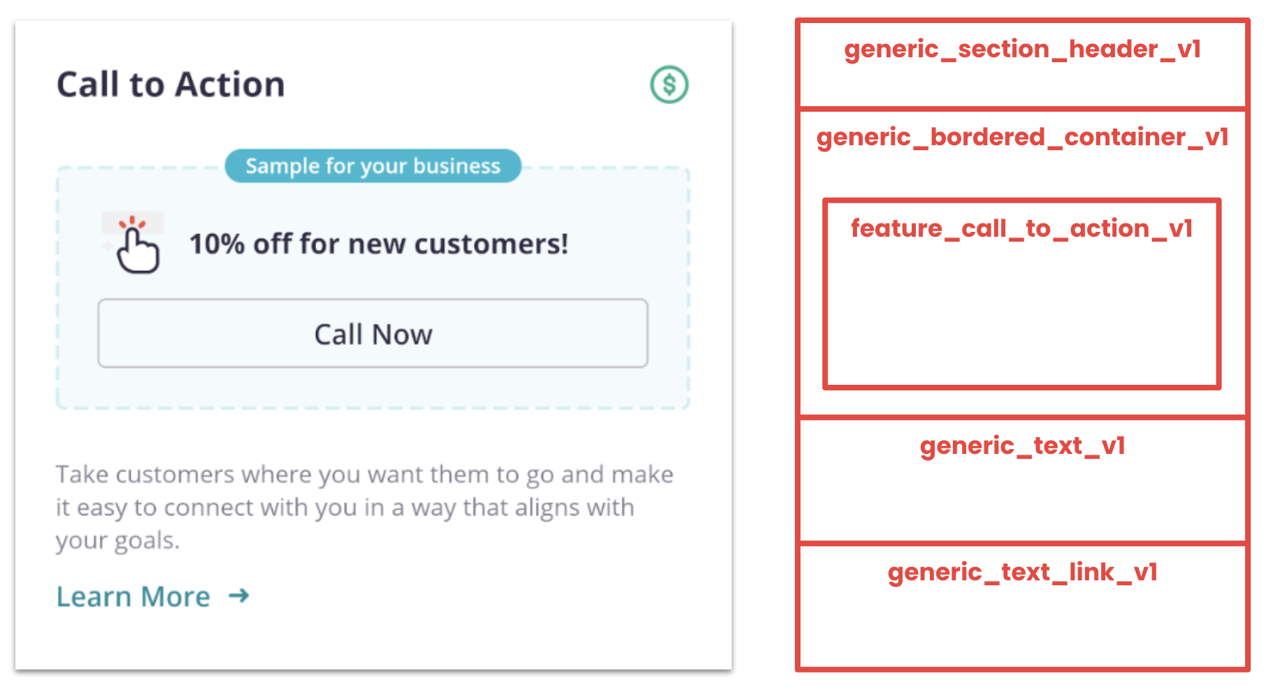
iOS and Android provide mechanisms to recycle views when scrolling, so using vertical stacks of simpler, reusable components improves scroll performance.
Initially, we were worried that containers would impact scroll performance and memory consumption, especially with high levels of nesting. But we kept finding designs that benefited from containers. In practice, we don’t nest more than one or two levels. On Android, containers are nested RecyclerViews that share a common RecycledViewPool, allowing re-use of simpler components such as text, buttons, and images.
Rendering components on clients
On the client, components are rendered with a factory associated with the component type. The same factory handles multiple versions of the same component. We typically have one implementation of each component (GenericButtonComponent) on the client, and the factory maps the server-driven component data to an internal configuration.
class GenericButtonComponentFactory: GenericComponentFactory {

    // Used by the BNF infrastructure to build a catalog of
    // available & deprecated types
    override val availableTypes = listOf(V1, V2)
    override val deprecatedTypes = listOf(V1)

    override fun create(
        component: GenericComponent,
        data: GenericComponentData
    ) = when (component.type) {
        V1 -> createV1(component.id, data.generic_button_v1)
        V2 -> createV2(component.id, data.generic_button_v2)
        else -> throw IllegalStateException("Unexpected component ${component.type}")
    }

    fun createV1(id: String, data: GenericButtonDataV1): GenericButtonComponent {
        // Convert GenericButtonDataV1 to an internal state
        // Construct & return the GenericButtonComponent
    }

    fun createV2(id: String, data: GenericButtonDataV2): GenericButtonComponent {
        // Convert GenericButtonDataV2 to an internal state
        // Construct & return the GenericButtonComponent
    }

    companion object {
        const val V1 = "generic_button_v1"
        const val V2 = "generic_button_v2"
    }
}
Generic Actions
A generic action is a side effect that occurs when the user interacts with a screen or component. A generic screen or component can trigger actions under any number of conditions, such as when the user views the screen or taps the component.
Like generic components, every generic action has a unique ID (open-blog-url) and type (generic_open_url_v1), and we use naming conventions to distinguish between generic and feature-specific actions (feature_close_business_v1).
As with generic components, the BNF was designed to support a rich, extensible library of actions. Here’s a sampling of actions:
| Generic Action | Description |
|---|---|
| generic_open_url_v1 | Opens a deep link, which supports “https”, “tel”, “yelp”, and “yelp-biz” schemes |
| generic_close_screen_v1 | Closes the current screen and opens an optional URL to navigate to the next screen |
| generic_show_screen_v1 | Opens another screen using a nested screen configuration |
| generic_reconfigure_screen_v1 | Reconfigures the current screen with a new screen configuration |
| generic_update_property_v1 | Updates the value of a generic property, which represents a piece of application state |
| generic_scroll_to_component_v1 | Scrolls the screen to a specified component |
| feature_close_business_v1 | Marks the current business as closed, which has a lot of feature-specific side-effects |
Configuring actions
In a remote screen configuration, each action type has a corresponding data model:
GenericOpenUrlDataV1:
  properties:
    url:
      description: Link to be opened when the action is triggered
      type: string
  required:
  - url
  type: object
In a local screen configuration, actions can be configured with the DSL in an actions block:
button(
   text = "Learn more on our blog",
   style = PRIMARY,
   tappedActions = actions {
      openUrl("https://engineeringblog.yelp.com")
  }
)
Handling actions
We use an event-based architecture on both iOS and Android to handle user interactions. Generic actions are events, which are either Swift structs or Kotlin data classes. For example, on Android, we have an OpenUrlEvent to model generic_open_url_v1 in remote screen configurations.
data class OpenUrlEvent(val url: String): GenericScreenEvent()
Android uses a Model-View-Intent (MVI) architecture where components publish events (intents) to a shared event bus. When the user taps a component, the component will publish its tappedActions.
class GenericButtonComponentViewHolder :
    GenericComponentViewHolder<GenericButtonComponentState>(
        R.layout.view_generic_button_component
    )
{
    lateinit var tappedActions: List<GenericScreenEvent>

    private val button by clickView<GenericButton>(R.id.button) {
        eventBus.sendEvents(tappedActions)
    }

    override fun bind(state: GenericButtonComponentState) {
        button.configure(state)
        tappedActions = state.tappedActions
    }
}
The event will be delivered to a matching intent handler that knows how to process the user’s intent and update the UI state.
class NavigationIntentHandler: GenericScreenIntentHandler() {

    @Event(OpenUrlEvent::class)
    fun handleOpenUrl(event: OpenUrlEvent){
        with(event.url) {
            when {
                startsWith("tel:") -> openTelLink(this)
                startsWith("https:") -> openSecureHttpLink(this)
                startsWith("http:") -> openUnsecureHttpLink(this)
                startsWith("yelp-biz:") -> openCustomLink(this)
                else -> reportUnsupportedLinkError(this)
            }
        }
    }
}
Generic Properties
Most UIs are dynamic; they need to respond to user interactions and changes in application state. For example, businesses can exchange messages with their customers, and we want to show the number of unread messages as a badge component.

Modeling generic properties
We represent a generic property using a dot-separated hierarchical path and an associated data type:
businesses.{business_id}.inbox.messages.unread.count<integer>
A generic property can have path parameters that provide additional context. For example, each business has a separate inbox, so the {business_id} parameter corresponds to the unique business ID.
To a generic component, a generic property is just a strongly-typed variable that it can read or write. The generic component doesn’t know the meaning of the data (the number of unread messages) or how the data is stored or updated.
In a remote screen configuration, we use the GenericProperty object to model properties.
GenericProperty:
    properties:
      path:
        description: A dot-separated hierarchical path for the property
        type: string
      type:
        description: Represents the property type
        type: string
    required:
    - name
    - type
    type: object
Supporting generic properties
Each generic property has a generic property manager that handles reads and writes.
On Android, we resolve a generic property into an RxJava Observable backed by a BehaviorSubject, which remembers the latest value. A generic component subscribes to the Observable to receive new values and update its view.
class BusinessInboxPropertyManager: GenericPropertyManager<Int> {

    val inboxPropertyDefinition =
        GenericPropertyDefinition(
            "businesses.{business_id}.inbox.messages.unread.count"
        )

    override val properties = listOf(inboxPropertyDefinition)

    private val subjectMap = mutableMapOf<String, BehaviorSubject<Int>>()

    override fun get(path: String): Observable<Int> {
        return getOrCreateSubject(path).hide()
    }

    override fun set(path: String, value: Int) {
        getOrCreateSubject(path).onNext(value)
    }

    private fun getOrCreateSubject(path: String): BehaviorSubject<Int> {
        return subjectMap[path] ?: BehaviorSubject.create<Int>().also {
            subjectMap[path] = it
        }
    }
}
Building dynamic components with generic properties
The BNF supports a generic_badge_v1 component that represents a basic badge with a dynamic count using a generic property.
GenericBadgeDataV1:
    properties:
      dynamic_count:
        $ref: #/definitions/GenericProperty
    required:
    - dynamic_count
    type: object
On Android, we map the generic property to an Observable<Int> in the component’s MVI state.
// The BadgeComponent’s MVI state stores an Observable
data class BadgeComponentState(
   val dynamicCount: Observable<Int>,
   @ColorRes val color: Int = R.color.red
)

// The BadgeComponenFactory resolves a generic property into
// the Observable required by the MVI state using the
// GenericProperties registry.
fun createBadgeComponentState(data: GenericBadgeDataV1)
   = BadgeComponentState(
         dynamicCount = GenericProperties.get(data.dynamicCount.path)
     )
The component subscribes to the Observable<Int> and updates the badge to reflect the current code.
// The BadgeComponent subscribes to the Observable
state.dynamicCount
  .doOnSubscribe {
      // Keep the badge invisible until we have the first count
      badgeView.isVisible = false
  }
  .doOnSuccess {
      // Update the value of the badge!
      badgeView.value = it
      // Don’t show the badge unless there’s a non-zero count
      badgeView.isVisible = (it > 0)
  }
  .doOnError {
      // If there’s an error, hide the badge
      badgeView.isVisible = false
  }
  .subscribe()
  .autodispose()
We’re still experimenting with generic properties and refining the use cases. We believe they are a necessary concept to unlock dynamic, server-driven UIs.
Current Use Cases
We’re using the BNF to power the Home, Yelp Ads, and Business Info, and More tabs. These tabs are remotely configured screens because they host dynamic, personalized content. The Yelp Ads tab hosts the Ads Dashboard screen, which was the first screen built entirely from scratch using the BNF. We’ll share more about this in a future blog post; stay tuned!

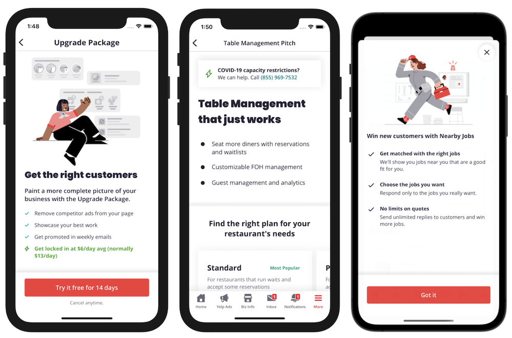
We’re also using the BNF to power several in-product marketing screens. These screens are usually remotely configured to give our marketing and product teams more direct control, but sometimes we build them locally first using our screen configuration DSL.
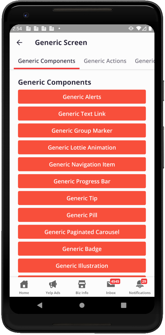
Finally, we’re using the BNF to build debug screens to prototype new designs or test individual generic components, actions, or properties. These screens are locally configured with our screen configuration DSL.
Future Directions
Building a Better Backend
SDUI pushes more of the business and presentation logic into the backend. Most backend engineers aren’t familiar with mobile app development or building mobile UIs. Consequently, they need better infrastructure for making, testing, and deploying their changes. We also need better tooling for our marketing and product teams to make changes, too.
Adopting SwiftUI and Jetpack Compose
One of our design principles is “Adopting Best Practices.” We’ve therefore watched the evolution of SwiftUI and Jetpack Compose with great interest. Both frameworks support building composable, dynamic UIs with a simple declarative syntax. We hope to adopt these new frameworks in the near future.
Adopting GraphQL
Yelp is currently migrating our web and mobile apps from individual REST APIs to a unified GraphQL schema. We’re planning to migrate the BNF to GraphQL, which offers better support than REST for making changes without breaking backwards compatibility. Mobile clients must write explicit GraphQL queries that describe the types and fields they support. With our REST API, we are frequently creating new versions of entire objects (GenericButtonDataV7) or APIs just to add one field safely. With GraphQL, we can evolve our schema incrementally.
Building a Yelp Native Foundation
Our Consumer App and Biz App handle separate sides of the same transaction – connecting consumers to great local businesses. In many cases, building a new feature requires changes in both apps. For example, when the Biz App added features for businesses to provide COVID-related updates to consumers, the Consumer App added corresponding features for consumers to see those updates.
When we started the BNF in 2019, product teams working on the Consumer App were also starting a shared server-driven foundation for similar reasons. Unfortunately, the Biz App and Consumer App had different REST APIs and separate Git repositories. We made the practical decision to share ideas and techniques but not code. Now we’re slowly moving towards a common Yelp Native Foundation by migrating to a unified GraphQL schema and adopting monorepos.
We’re very excited about the future of SDUI at Yelp and in the industry as a whole. Many companies, such as Airbnb and Doordash, have recently published the details of their own shared, server-driven foundations, and there are open-source efforts, such as Beagle. We’ve noticed many similarities between our work and these projects, which suggests there are some natural design patterns for implementing SDUI. We hope this blog post contributes to the growing SDUI community. Keep an eye on this blog for updates on our progress!
Become a Mobile Software Engineer at Yelp
Want to help us grow our mobile foundation on iOS?
View Job