Now You See Me: How NICE and PDQ plots Uncover Model Behaviors Hidden by Partial Dependence Plots

-
Shichao Ma, Applied Scientist
- Dec 17, 2020
Many machine learning (ML) practitioners use partial dependence plots (PDP) to gain insights into model behaviors. But have you run into situations where PDPs average two groups with different behaviors and produce curves applicable to none? Are you longing for tools that help you understand detailed model behavior in a visually manageable way? Look no further! We are thrilled to share with you our newest model interpretation tools: the Nearby Individual Conditional Expectation plot and its companion, the Partial Dependence at Quantiles plot. They highlight local behaviors and hint at how much we may trust such readings.
A not NICE world
At Yelp, we have ML models for personalized user and business owner recommendations, the retention of advertisers, wait time prediction in Waitlist, ads targeting, business matching, etc. Although the prediction quality is always one of the key priorities for any ML model, we also care deeply about the interpretability of the model. As ML practitioners, we often use model interpretation tools to do sanity checks on how a model is generalizing from the features. More importantly, exposing the “why” behind a model’s behavior to its consumers, who often are not ML practitioners, can give them confidence in its accuracy and generalizability, or lead them to deeper applications and better business decisions.
Since most of our models are complex in order to achieve better prediction quality, they can also be harder to decipher. One common question in model understanding is, “How do changes in a feature’s values relate to changes in the prediction?” Previously, we used the popular PDP and the sensitivity plot to take snapshots from the model that are easy for a human to understand. A PDP shows how predictions change, on average, when varying a single feature1 over its values (e.g., min to max) and holding the other features constant. PDPs can answer questions like, “What would users’ wait time be respectively if the local temperature were 30°F, 50°F, and 70°F?” In contrast, a sensitivity plot varies a single feature relatively (e.g., -15% to +15%) while holding the other features constant. Sensitivity plots can answer questions like, “If the weather had been 10% warmer for these days (temperatures on these days in general are different), how would wait time estimates have changed?”
However, these tools are not without some limitations. First of all, both PDP and sensitivity plots operate at an aggregated level, meaning that we average all the data points to achieve one single curve. This aggregation may hide differences in various subpopulations. For example, when creating either a sensitivity plot or a PDP, we could imagine the prediction goes up in half of the population and goes down in the other half when we increase a feature. When we average the two halves together, we may falsely conclude that the feature has no marginal contribution to the prediction. Secondly, when drawing PDPs or sensitivity plots over sparse data regions, both plots become untrustworthy. For example, if we only have a few restaurants open at 0°F, then it’s usually unwise to generalize from a PDP for wait times around such low temperatures.
To address these concerns, we came up with two new tools: the Nearby Individual Conditional Expectation (NICE) plot and its companion the Partial Dependence at Quantiles (PDQ) plot. Instead of the aggregate effect, the NICE plot individually draws changes in predictions due to local perturbations on top of the scatter plot between feature values and corresponding predictions. The PDQ plot helps to summarize the heterogeneity in the NICE plot by aggregating partial dependence at different quantiles of predictions. In practice, we often need to review the PDQ plot when we have difficulties in figuring out the general patterns in a NICE plot.
What is the NICE plot?
NICE plots examine the Individual Conditional Expectation in the neighborhood of the original feature values. Below is an example plot from one feature in one of our retention models.
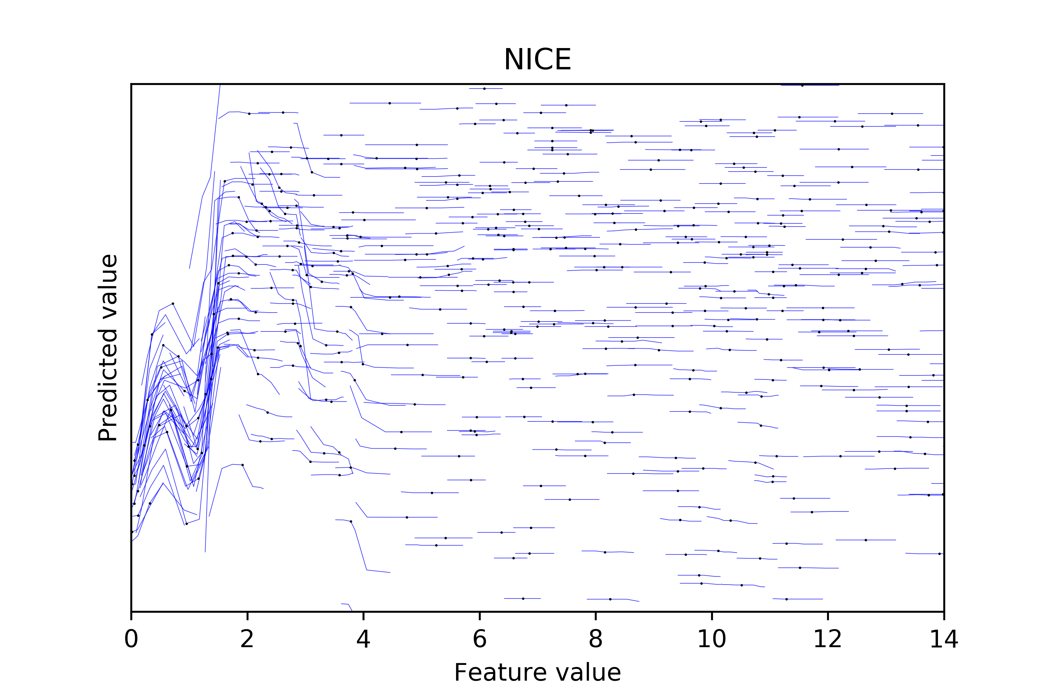
Note: This graph contains 1000 data points and each blue line consists of 7 points.
We made this NICE plot using the following algorithm:
- Select a random sample of data points (if your dataset is large).
- Make a scatter plot of feature values and model predictions (the black dots).
- Make nearby perturbations about each feature value (e.g.,
lower_bound= 0.9 *feature_valueandupper_bound= 1.1 *feature_value) and evenly sample N points within the bounds (we recommend N to be odd so the original feature value is included). - Record their corresponding perturbed predictions.
- Draw lines between the N points and corresponding predictions on the scatter plot (the blue lines).
A NICE plot foremost shows the bivariate distribution between feature values and their corresponding predictions. Therefore, it is straightforward to observe the sparsity between the two. In the above example, the model rarely gives a low prediction when the feature is smaller than 4 (exhibited by the white space on the bottom left corner) and it rarely gives a high prediction when the feature value is roughly smaller than 1 (illustrated by the white triangle-like shape on the top left corner).
More importantly, this plot only examines marginal effects at the neighborhood of each observed data point, which helps to show heterogeneous effects and may hint at any interaction effects. In the above graph, the marginal effect goes up and then goes down when the feature value is in the range of 0 to 1. Starting from 1, the effect is positive and large in magnitude until the feature value reaches to 2. In the range 2 to 4, we observe some heterogeneous effects: some lines are downward sloping while others are flat, and the flat ones are observed more often when the prediction gets larger. When the feature value is greater than 6, all the NICE lines are flat throughout the region.
On the other hand, the information in the PDP and the sensitivity plot of the same feature lacks many details.
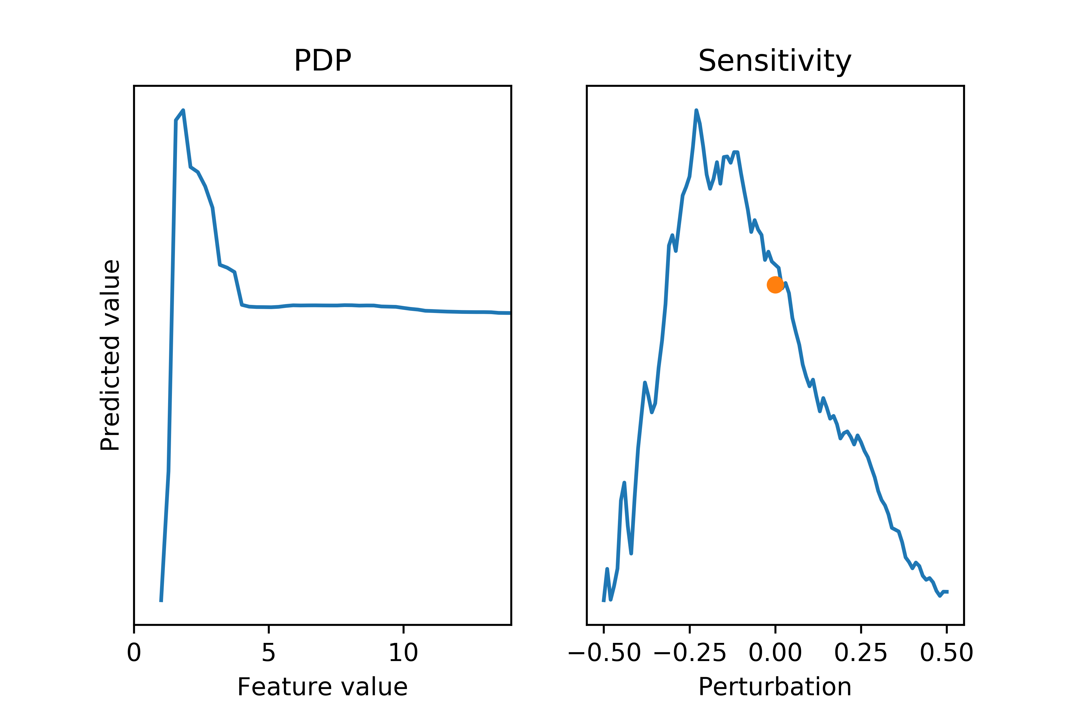
Note: the y-axes in these figures have narrower ranges than the previous NICE plot because of aggregation.
The PDP (left) correctly captures the most significant inverted V-shape structure when the feature is smaller than 4 and the flat shape afterwards, but it loses some subtleties contained in the V-shape. The sensitivity plot (right) is misleading. From it, you may conclude that tweaking the feature would yield a single-peaked relationship with the peak at -20% of the feature value, which is true only in aggregate. From the NICE plot, we can see this relationship fails to hold for most, if not all, individual data points: the marginal effects are flat when the feature values are greater than 4, and have the “wrong” shape for samples in the valley near one.
When trying to apply the above algorithm to binary or categorical features, we cannot make nearby perturbations and have to examine the change from one value to another. Below is one example from our system.
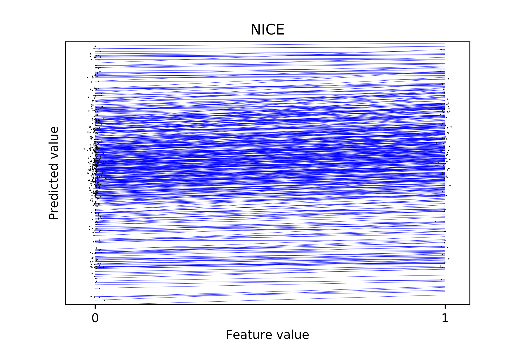
Note: we apply jitter to the feature values to make the density easier to see.
As one can see, the NICE plot is still useful to demonstrate heterogeneous effects. In the above figure, the lines at the top of the figure (corresponding to high prediction values) are flatter. But when the predictions get smaller, the lines get steeper. For comparison, below is the PDP of the same feature:
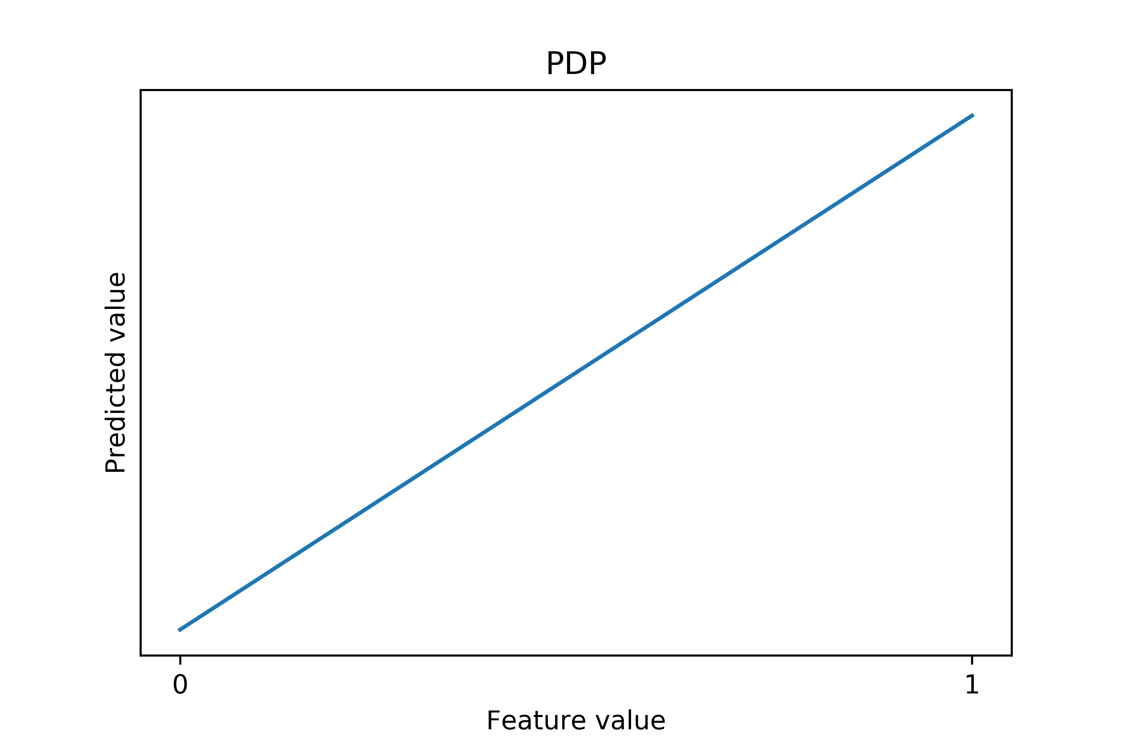
Note: the y-axis in this figure has a narrower range than the previous NICE plot because of aggregation.
Clearly, the PDP manages to capture the aggregated trend, but misses the differences in marginal effects when the predicted values are different. Using this plot one cannot see the heterogeneity in these marginal effects.
The structures contained in a NICE plot, however, may be both a blessing and a curse. When the model has complex interaction effects, it is hard for a human to decipher all the subtleties from the numerous dots and lines in a NICE plot. To mitigate this issue, we developed a companion tool: the PDQ plot.
What is the PDQ plot?
A PDQ plot is a variation of the conventional PDP. It stands on the middle ground between the fully local NICE plot and fully global PDP. It plots the partial dependence conditional on some pre-specified quantiles of the predicted values, which helps to simplify the heterogeneity and emphasizes the major structures in a NICE plot. Here is the PDQ of the first NICE plot in this article:
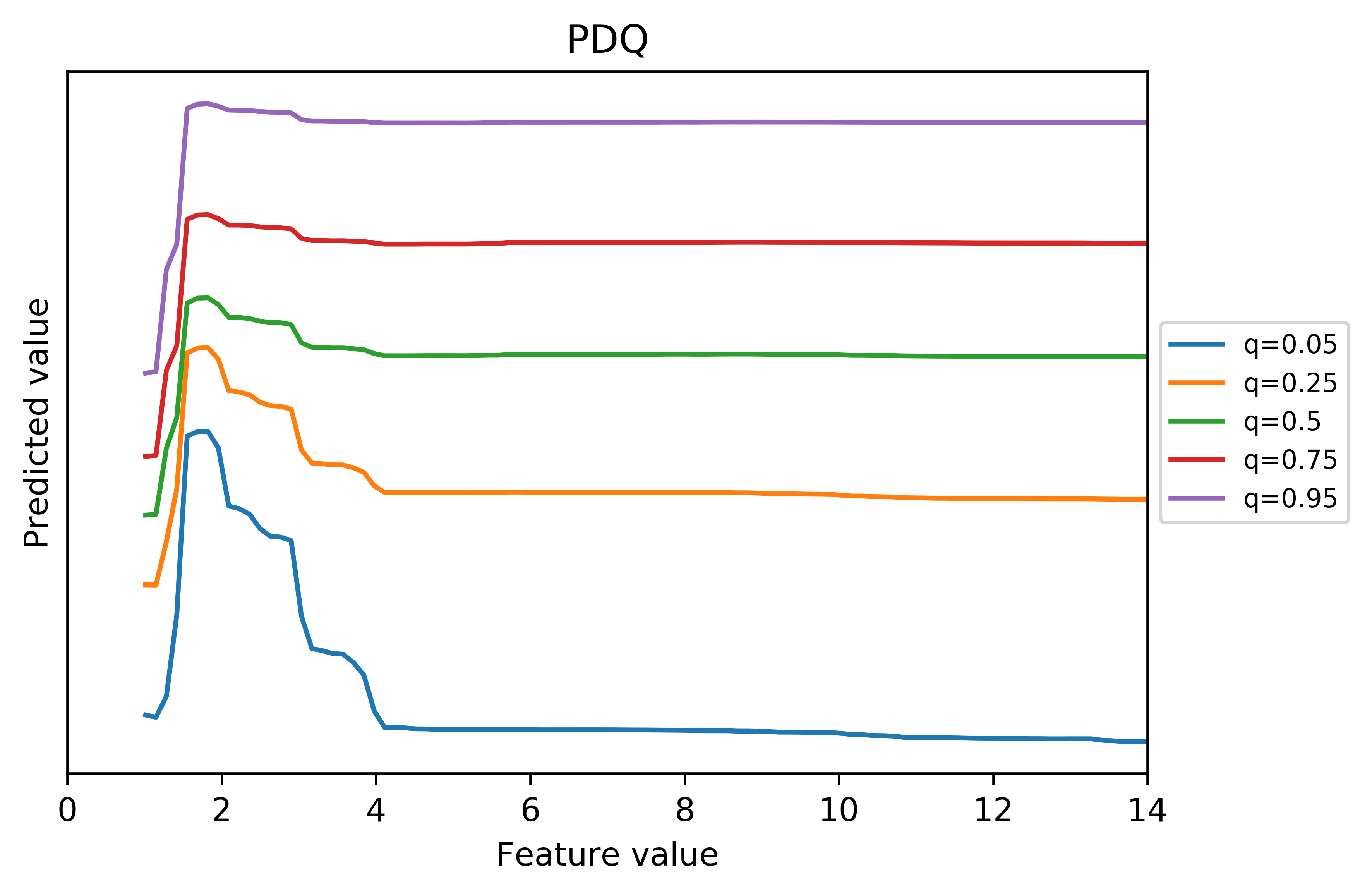
We made this PDQ plot using the following algorithm:
- Select the quantile values to be drawn. Our default values are 0.05, 0.25, 0.5, 0.75, and 0.95.
- For each quantile, find data points that can produce predictions that are close to the desired quantile (e.g., the desired quantile +/− 0.001).2
- Again for each quantile, generate and plot partial dependencies using only those samples.3
From the plot, we can easily identify a sharp inverted V-shape structure when the predicted value is small, but this non-monotonic effect gradually flattens out as the prediction increases. When the prediction is sufficiently large (starting from the 0.75 quantile), we do not see a significant drop after the initial rise.
In practice, one can use the corresponding PDQ plot to help make sense of the NICE plot. For example, it may be unclear to some readers that the non-monotonic effect gradually flattens as the prediction increases by just inspecting the NICE plot. Indeed, a lot is going on in a small region. But after observing the PDQ plot, one can go back and re-examine the NICE plot.
If PDQ plots can represent information confined in NICE plots in a concise fashion, why don’t we solely rely on them? Firstly, PDQ plots still need to aggregate some data. Therefore, it is difficult, if not impossible, to differentiate a mix shift from an inherent behavior change of the model by just examining a PDQ plot. For example, you may possibly think that the gradually flattened V-shape structure is because the negative marginal effects are less steep when the predictions are higher, which can be ruled out with the help of the corresponding NICE plot.
Moreover, PDQ plots have a data sparsity issue. We cannot observe the bivariate distribution in PDQ plots. Therefore, in some regions we do not have many, if any, data points. The following two figures constitute a good example.
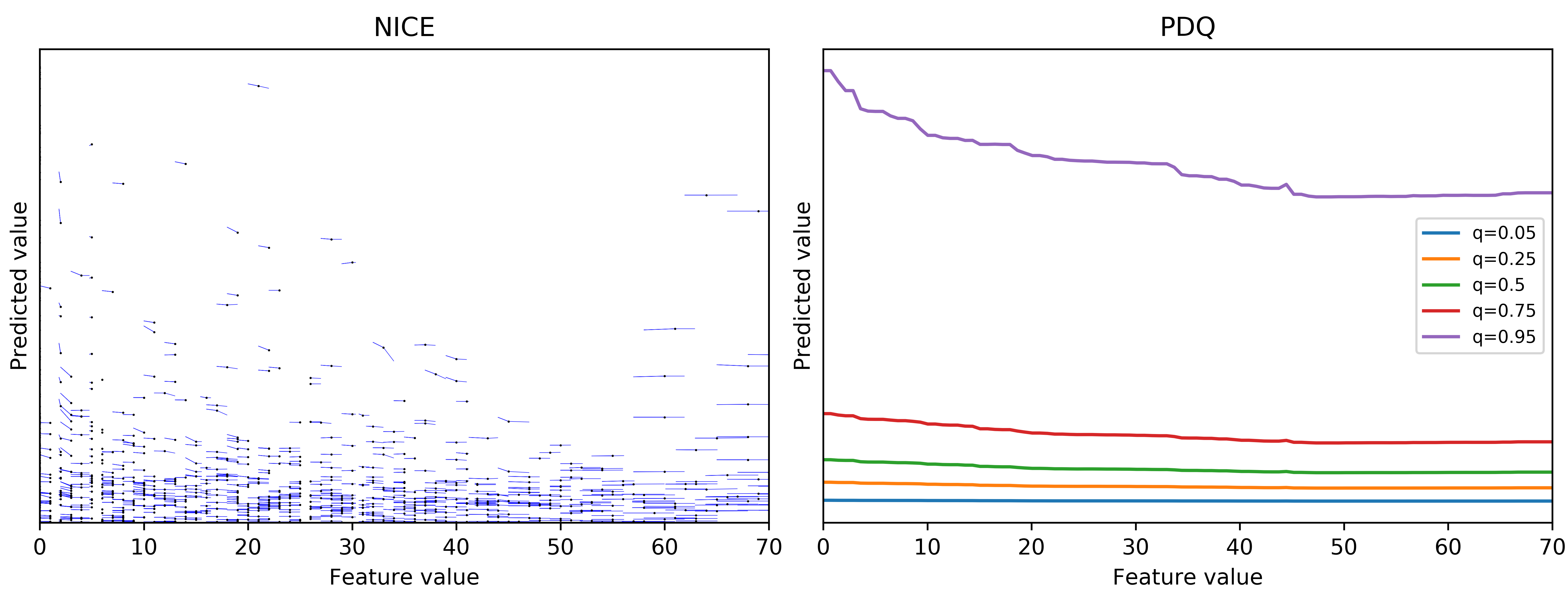
It is very tempting to conclude that the effect gradually flattens out after the feature value is greater than 50 when q=0.95 from the PDQ plot. However, we can see there are almost no data points with feature value greater than 50 and the prediction very high. Therefore, it is probably unjustified to assume such a relationship exists in that region.
Finally, why do PDQ plots work in practice? We have repeatedly observed that the patterns in NICE plots can be roughly grouped by the predicted values. This probably is because samples that produce similar predictions are similar for the purpose of a specific prediction task. Therefore, these samples are more likely to share a common marginal effect.
Conclusion
A NICE plot is an individual conditional expectation plot restricted to feature values near the observed ones. It shows how the model would behave if we perturb a feature near its observed values while keeping all other features fixed. Reading a NICE plot can also tell us how much we can trust such behaviors because the plot contains information about data sparsity.
The PDQ plot helps to summarize the heterogeneity in the NICE plot by grouping partial dependence at different quantiles. We typically consult the corresponding PDQ plot when we have difficulties in figuring out the general patterns in a NICE plot. PDQ works because data points with similar predictions behave more similarly than the ones without in a given prediction task.
Acknowledgements
The original idea of the NICE plot belongs to Jeffrey Seifried. Blake Larkin, Nelson Lee, Eric Liu, Jeffrey Seifried, Vishnu Purushothaman Sreenivasan, and Ning Xu (ordered alphabetically) help read through the earlier versions and make helpful comments.
Notes
1: We can vary multiple features and draw a multivariate PDP, but the interpretation gets very difficult past two features!
2: To reduce noise, we do not just select a handful of data points exactly at the pre-defined quantile. In general, samples with different predictions may behave differently in terms of their marginal effects, and you don’t want to be fooled by a tiny sample.
3: You can check scikit-learn’s implementation if you need help computing partial dependencies.
Become an Applied Scientist at Yelp!
Are you intrigued by data? Uncover insights and carry out ideas through statistical and predictive models.
View Job